Tag Archives: Laura Brainard Raborn

One “Ah Haa” moment after another in beautiful Telluride

IMG_4298Telluride, CO is one of those places that has appeared and reappeared on my radar for many years. Imagine my delight when the opportunity to finally visit presented itself in the shape of a teaching job. Not only is the town known for its festivals, art scene, long list of heavenly summer and winter activities, and foodie atmosphere, there is an additional resource that serves locals and visitors well – the outstanding Ah Haa School for the Arts. Just visit the website to see the countless events, classes and activities hosted by the school. IMG_4343The school is so enthusiastically embraced by the community that growth has exceeded the space for a second time since its inception in 1990. Partnering with the city of Telluride, plans are in the works to move into a 10,000 square foot space in 2020. In the meantime, the bustling program, which includes a full schedule of children and adult art classes, is located in the historic train depot next to the gondola and along the idyllic river trail at the base of the Telluride Ski Resort.IMG_4250

For the past four years I have worked to hone a mixed media workshop. Teaching the class roughly 5 times a year brings me great joy. It is an alternative to spending long hours in the studio on commission jobs and getting ready for exhibits. Meeting and getting to know the students, who come into the class with varied degrees of art experience, is a highlight and has lead to many treasured friendships. Equally as valuable (as many teachers express) is the process of teaching – the demo prep, the lectures, the critiques, the exposure to student opinions and perspectives – provides me with a boost of inspiration, gratefulness and education.

IMG_4231Last week at the Ah Haa School was no exception to the joys and benefits of teaching. After settling in at the Mountainside Inn, I walked over to the art school to meet the people I only knew through email and to see the workshop space. Then I headed over to the recently renovated and wildly popular, Wilkinson public library to present a lecture about the purpose of art, mixed media techniques, and my own two bodies of work. Afterward, one of the students kindly offered to take me to a local favorite, Esperanza’s, for a quick bite. Starting with the shuttle driver from the Montrose airport and ending in a lively bar discussion about affordable housing, I immediately noticed the uplifting, positive, engaging atmosphere created by the people of Telluride.

The next day during our class introductions, I quickly realized the positive encounters IMG_4239
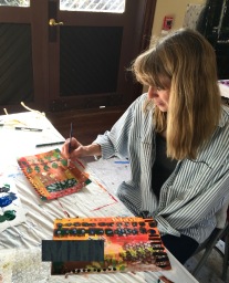
from the previous day were not just beginner’s luck. In fact, as the students told a little about themselves and their workshop goals, I found myself in awe of their experiences, careers and achievements. I was relieved to learn that many of the methods and materials on my agenda were new to most of the students, so I would have something to offer the accomplished group.

For anyone out there interested in the agenda, here is a bare bones outline I use for the Mixed Media workshop series:

  1. Various ways to apply paint
  2. How to make and use stencils and stamps
  3. Image transfer 
  4. Collage techniques
  5. How to use gel medium (ie building texture)
  6. Incorporating lines, doodles, drawings and text

Throughout the workshops, we also discuss:

  1. Elements of Art and Principles of Design
  2. How to critique artwork including our own
  3. Compositional tips
  4. How to resuscitate a “failed” painting

Each morning was open to exploring and the afternoons dedicated to teaching. One morning I tried out cross country skiing in Town Park (thank you Telluride Nordic Association!), one morning I hiked up Wiebe trail (thank you for the directions, Kris!) and one morning I walked around town visiting shops and galleries.

IMG_4264

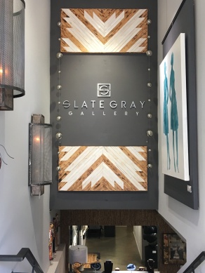
I wasn’t sure what to expect when visiting the galleries. Would I find a focus on the beautiful surrounding landscape such as the aspen tress? Would the galleries feature winter sport themes? Would most of the art be contemporary or traditional? Representational or abstract? Even with the three free mornings (there is so much to see and do in this little town!), I only had time to visit two: Telluride Gallery of Fine Art and Slate Gray Gallery.
IMG_4326IMG_4329

As the oldest gallery in town, the Telluride Gallery of Fine Art, represents a range of artists from locally known to internationally recognized….and when I say “internationally recognized,” take, for example, Maya Lin, recipient of the 2016 Presidential Medal of Freedom and designer of the Vietnam Veterans Memorial in Washington, DC. I’m still disappointed that I missed her lecture last year at Crystal Bridges Museum of American Art in my home state of Arkansas. The gallery also represents Malcolm Liepke, whose luscious figures I’ve studied since grad school. One of my favorite artists on their roster is Krista Harris (who teaches at the Ah Haa School!). Though her style is uniquely her own, the large abstract paintings are reminiscent of Cy Twombly’s mark making and Joan Mitchell’s energetic brush work. These are paintings one can explore and enjoy for a long time, discovering nuances and details with each visit.

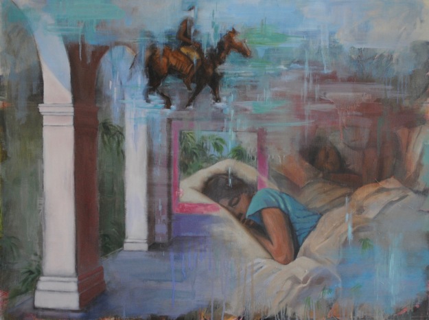
Quilt & Poppy Diptych by Nina Tichava

At the Slate Gray Gallery, I had the pleasure of visiting with the manager Bekah Kolbe, who I previously and serendipitously met on a Facebook group page. It is strange how social media can enrich in-person meetings by providing a little context and familiarity. Bekah kindly gave me a tour of the space while we talked about art, artists, process and politics. I was immediately drawn to the work of Nina Tichava possibly due to her use of my favorite art element that students hear me talk about constantly: Contrast. For example, in “Quilt and Poppy Diptych,” she employs contrasting lines (thin versus thick, measured versus organic), contrasting colors (orange against blue, black against white), contrasting shapes (organic versus geometric), contrasting sizes (tiny and delicate versus large and bold) and contrasting marks (soft and loose versus hard and rigid). What’s the result? Tension, energy, focus and movement that grabs the viewers attention and makes me want to lookIMG_4315 at the work for a long time. These two galleries were well worth the visit with a mixture of mediums and styles of fine art. To get a more complete picture of the Telluride art scene, next time I will be sure to visit more galleries and will check out the Telluride Arts HQ as well as the American Academy of Bookbinding.

Before signing off, I need to make note of a few food favorites (confession – this is one of those posts where the food might take up as much space as the art). I wish I could have visited Ghost Town for every single meal. I don’t know what makes it spectacular, but they have the best avocado toast I’ve ever had. Maybe it is the bread? Or the seasoning sprinkled over the avocados? Or the zesty hint of lime? It was almost impossible to IMG_4256decide what to order when looking over the menu and I’ve heard every breakfast and lunch item is equally as delicious. The tea and coffee made it a mandatory must stop each day even though the Mountainside Inn keeps their coffee caraft hot and full all day long.

IMG_4266And I must mention Tacos del Gnar. As I waited for the place to open, another customer joined me at the table out front. A couple walked by and asked if the tacos are good, and the man sternly answered “Well, yes, of course they are!” The woman asked what makes them so special, and he stampered, “I can’t explain, just… everything!” Which sums up my description. I don’t know what makes their tacos supreme – but they are.

As mentioned earlier, I ate at Esperanza’s one night with a student and I’m not sure which was better – the welcoming crowd or the food. I found myself wishing I could take the coleslaw home like my companion did. The same student kindly ushered me one evening after class up, up and away to Allreds. Accessible only by gondola, I expected a rustic ski joint but I was wrong. This is fine dining with the most spectacular views. The reservation list is full for months and we were lucky to squeeze inIMG_4246 at the bar (hello Trenton and JoJo!) which is a bit more affordable than the dining room. I would have disturbed too many diners by taking photos of the surrounding San Juan mountains so instead I give you this: a mountain of strawberry rhubarb cobbler.

As a finale, several of the students were available for dinner at Siam on my last night in town. While classmates Nancy and Laurie were certainly missed, I am so grateful for the extra time spent with many of the students. Being treated to dinner was almost more than I could bare as a grand gesture of kindness that perfectly mirrored IMG_4357every special interaction in Telluride. Finally, I must thank Kris Kwasniewski at the Ah Haa School for accepting my teaching proposal and inviting me to the school as a visiting artist. Kris and the Ah Haa staff were organized and accommodating, making the job and visit a smooth and rewarding experience. Thank you to Kris, Kathleen, Jess and Tara!

Until next time…thanks for reading.
Laura

IMG_4354

Beating the Heat in Arkansas: A Super Cool Art Scene (Part 3)

“Passage” by Dominique Simmons

In Part 2 of this series, I noticed a recurring theme while describing the various venues and exhibits we visited in Bentonville, Arkansas. It occurred to me again and again that art enables us to better understand the perspective of others. That theme continues as I make my way to the Fine Arts Building at the University of Arkansas at Little Rock.

Regardless of your political persuasion, a visit to the exhibit, “Nasty Woman” certainly fulfills the purpose of experiencing various perspectives. It is often said that artists reflect the cultural pulse of society. Of course, no single person, or small group can speak for all. But the Nasty Woman exhibit, like it’s counterparts popping up around the globe, reveals the ways in which many female artists are responding to a political and social environment that feels oppressive for some.

This exhibit showcases multiple themes, materials, and concepts to present the overarching theme of gender inequality. Some of the artwork communicates protest, some celebrates women, some asks for recognition of unrecognized women. Some addresses the roles women hold in communities and families, some of the work addresses reproductive rights or our cultural focus on women’s body parts. Some of the pieces are nurturing, some are aggressive

“Mammary Ducts” by Mia Hall

As women strive to progress, and demand rights such as equal pay, there seems to be a backslide that has developed in the last two or three years. For example, what do we make of the recent shift in public response to breastfeeding? Why has it become “gross” and “inappropriate”? Women’s nipples don’t differ greatly from men’s, so why is the exposure of women’s nipples not acceptable? We even have a biological purpose for them, yet, in a strange reversal, breastfeeding has become an occupational hazard for many nursing mothers. Regardless of how you view breastfeeding, the issue of judging and legislating women’s bodies remains, and it is one that Mia Hall addresses in her installation, “Mammary Ducts.” Our culture places in inordinate amount of critique, shame and observation on women’s body parts. They are just nipples, see?

One of my favorite pieces is by the Curator of this exhibit, Margo Duvall. The small size, circular shape and material (grainy wood) makes each portrait precious, like little artifacts to be revered. They are clean and direct, and seem to ask for overdue recognition. They are beautifully crafted like the women they present and the disks simply ask to be seen.

Regarding my own entry in this exhibit, there is something nagging at me that, I believe, is worth discussing. While reading the exhibit statement at the gallery entry, I wonder, Did I live up to this ideal with my pieces? Dr. Emily Gerhold writes, “While ‘Nasty Woman’ is not meant to promote a specific ideological position, it is, by both necessity and design, a product of the historical and social movement in which we live. Its artists extend themselves beyond the banality of a headline or sound bite to engage, on a deeply personal level, the urgent, powerful experience of being a woman.” 

Actually, I leaned right into the banality of a soundbite. Yup, my work is crass, it is nasty. And I am not proud. But it is a reflection of what I am seeing in our culture today, starting with our highest office. Why are women’s bodies being talked about the way they are? And should we not be outraged? Would it be more proper to whisper our responses to the vitriol, or better yet, silently swallow our responses as if we think the words mean nothing? Or worse, justify it? As if lewd words, and catcalls, and discrimination, and sexual harassment, and being grabbed is all ok and we need to just suck it up and get over it. I admit, I made no effort to make my message pretty, or feminine, or demur. These nine pieces are part of a larger group that simply reflects what I am seeing and hearing about women’s roles, women’s bodies, women’s looks and women’s healthcare policy being discussed ad nauseam in our society and in our governing bodies. The work is meant to draw our attention to language, the meaning and consequences of using words, the deconstruction of words and how language shapes our reality.

This slideshow requires JavaScript.

While direct language was not neccesarily prominent in the exhibit, I did find much of the work to be narrative. The slideshow above exemplifies how the exhibit provides insight into women’s lives and gives viewers ways of piecing together a story, a relationship, an action or an emotion.

Nasty Woman showcases the work of 36 female artists from across the nation and this post will get way too long if I respond here to all the thought-provoking work. The 36 artists included in the exhibition are: Zina Al-Shukri, Heather Beckwith, Darcie Beeman-Black, Megan Berner, Cynthia Buob, Beverly Buys, Susan Chambers, Melissa Cowper-Smith, Norwood Creech, Nancy Dunaway, Margo Duvall, Melissa Gill, Mia Hall, Louise Halsey, Diane Harper, Tammy Harrington, Heidi Hogden, Robyn Horn Erin House, Jeanie Hursley, Catherine Kim, Kimberly Kwee, Joli Livaudais, Angie Macri, Hannah May, Rosemary Meza-DesPlas, Catherine Siri Nugent Laura Raborn, Emily Rogers, Dina Ropele Santos, Dominique Simmons, Kasten Searles, Katherine Strause, Brittany Wilder, Kat Wilson, and Miranda Young-Rice.

If you are in the central Arkansas area please consider a visit to this important exhibit. Summer gallery hours: 9am-5pm, Monday through Friday. Gallery admission is free. There is a reception on Friday, Aug. 18th from 5:00-7:00 pm with a Curator Talk at 6:00 pm. See you there!
As always, thank you for reading. Next up: Art exploration in our nation’s capital city!
Laura

Painting Exhibit Opening at Argenta Library, North Little Rock, AR

screen-shot-2016-12-22-at-12-00-52-pm

Thank you to all who came out Friday night for the exhibit opening! To learn more about these paintings and the sources of inspiration, search this blog using key words “Harbour Island.” You can also visit http://arttalkkabf.blogspot.com or click here to listen to artist, curator and radio host, Rachel Trusty, interview Laura about her work and about the current exhibit.

The inspiration and ideas behind upcoming exhibit,”Island Dreams and Memories”

dsc_0529dsc_0166


dsc_0072

Island Dreams, 2016, oil on wood panel, 24×32″

I think often of an island that fills my childhood memories. My mind goes straight to certain places there: a sweaty dance floor at Sea Grapes before it was rebuilt and then after, the overturned beached dingy with a litter of puppies underneath, a horse named Francis in the living room of a house, Sunday breakfast at Pink Sands before Hurricane Andrew hit, the old Greek magnet’s burned down yet palatial ruins. I remember certain people and realize they are frozen in my memory untouched by time. Larry Cleary singing Night Shift, Dawson kindly walking me home, Gus behind the bar and at the pool table, Carol and Roger in their library, Angela barking orders. Sometimes we presume the people and places in our memories to be accurate accounts in the present. But time does not reach and alter places or people in our memories. They are frozen there until our minds can no longer play that slide show.

Mistakingly, I thought I was a part of this place. But it was and is a place of its own – I was just a shadow passing through. Now, after many years, I look back and ask, how can a place be so important to me, yet I am not important to that place? This is a question to ask ourselves as visitors when we do not contribute to a community with long term commitment, when we are not there through the good and bad, through the reality of living. When we visit a place, we are experiencing an alternate realm, that of a tourist. There is a closed door to the real life there. Considering the local people, their history, lives, families, work, personal struggles and celebrations, we realize how inconsequential we are as visitors. Fondness does not equal belonging.

DSC_0208

“Looking Back,” 2016, image transfer, collage and acrylic on paper, 14 1/4 x 21

Despite my fleeting time there, I started a group of paintings about a year and a half ago after visiting Harbour Island for the first time in over 20 years. Returning to a place after many years can be jarring because the present can show us the flaws in our memories, how we romanticize or selectively choose to store certain details and discard others. How we recreate the truth, rewriting our past to fit a script we want to believe. Even when our memories are relatively clear, the passage of time changes a place so we realize what we remember does not really exist anymore, except in our minds.

dsc_0059

Entry Point, 2016, oil on wood panel, 21×24 1/4″

In some ways, I started working on this group of paintings when I was 8 years old…I remember being obsessed as a child with the disheveled graveyards sprinkled around the island, with their cracked headstones, and overgrown wildness. Some of my first drawings and paintings were of those headstones, entangled in vines and home to flocks of chickens.dsc_0415

Using memories, photos and sketches from the island has become a vehicle to articulate ideas I’ve tried to convey for years through painting: that everything we see is a partial image altered by individual perception, that all things fade as time passes, and that our memories are altered by our minds plus the passage of time. This group of work is also influenced by the writings of Dr. Alan Lightman. Lightman is unique in that he has dual tenureship at MIT, in the Writing and in the Physics departments. Perhaps he is able to so eloquently write about memory and time because he understands it, not like most of us, in a vague and abstract way, but from a scientific perspective.

dsc_0096

Childhood Escape, 2016, oil on canvas, 36×24″

In the NYT article, “Ghost House of My Childhood,” Lightman writes, “Some philosophers claim that we know nothing of the external world outside our minds – nothing compared to what sways in our minds, in the long, twisting corridors of memory, the vast mental rooms with half-open doors, the ghosts chattering beneath the chandeliers of imagination.”

Some of the pieces in this exhibit are snapshots, like a frozen moment captured that can never be seen again in just that way. Some of the paintings reference nature overtaking a manmade structure, which alludes to the passage of time. And some of the paintings combine images like our memories smooshing together poignant moments into one illogical snapshot that we accept as a true moment in the past. For example:

Thank you for reading and I hope you enjoy the paintings and the ideas that inspired this group of work. Laura dsc_0781


Spring Break in NYC: Art Nirvana

In a time when art is more loosely defined than ever, where there are no limits to what materials artists use, where anything imaginable can qualify as art, and where idea sometimes trumps craftsmanship, I return home from a trip to New York City electrified and inspired. Only in David Zwirner did I wonder, “What the?” Having said that, I know my personal lack of understanding an art installation does not reflect poorly on the art; perhaps it is my limited exposure to certain materials or styles that leaves me perplexed. My own education or perspective could be the problem.

While visiting roughly twelve galleries and four museums during my daughters’ spring break, I was repeatedly delighted by the quality, talent, and thoughtful presentation. For this trip, I focused on painting exhibits and found that representational painting, much of which was figurative, dominated the walls. One reason I paint representationally is because I believe art is most powerful when the highest number of people can glean some understanding, some insight, some information about a subject presented. Art made for an exclusive few seems to deny itself the chance to speak clearly about culture, about society, about life and about issues in a way that can eventually serve as documentation of our time. But maybe art does not have to represent anything specific. Maybe odd installations tell of a need for something real, three dimensional, touchable, formidable in a world inundated with visual imagery. Yet I can hardly resist the allure of a two dimensional painting or drawing that serves as a magical window to an idea. Yes, two dimensional work is an imitation of something, it is a copy. But the flat plane can reach our minds, our emotions, our thoughts. A great painting or drawing feeds, informs, opens, provokes, teaches, records and delights us.

Following are a few highlights from our visit:

IMG_0565

Alyssa Monks, Become, 2015, oil on linen, 50 x 80 inches

Alyssa Monks at Forum Gallery. I expected to feel disappointment over her departure from water paintings. However, the current body of work, “Resolution,” is stunning and exquisitely painted. The artist merges the human form with forest and plant environments. While the figures embody large swaths of canvas, they do not dominate the space. Instead, towering trees and foliage promote the idea of humans as secondary to earthly growth. The paintings allow us to see the intertwined existence of all living things. Combining human features with elements from nature is difficult and looking closely at the paintings shows how the artist chose certain brush marks and colors. The Forum Gallery website allows viewers to zoom in on the brushstrokes which is helpful and revealing.


IMG_0562

Claudio Bravo, Morocco Triptych, 2009, oil on canvas

Claudio Bravo at Marlborough Gallery. For years I have tried to figure out what exactly draws me to the entrancing work of Bravo. He is able to arrange material in a way that encourages the viewer to imagine how the material folds and feels. He is a master of value, creating shadows, highlights and folds that become almost linguistic. The contrasting colors he often uses prompt the viewer to repeatedly return to the work. Though it is often the human figure that draws me to a painting, Claudio Bravo’s still lifes reveal a vision and skill that is always worth studying in person when given the opportunity.

big-black-hat-after-gainsborough-60-by-48

Rimi Yang, Big Black Hat After Gainsborough, oil on canvas, 60 x 48 inches

Rimi Yang at Stricoff Fine Art. I first fell in love with her fantastic layered work while studying my aunt’s fine art collection several  years ago. Since then, I have found Yang exhibited on the east coast, the west coast and in between in Austin, TX. Rounding the corner of 11th and 25th in Chelsea, my eye landed on this painting (here on the left) and I immediately knew I’d once again found one of my favorite artist’s work. As I struggle, sometimes failing and sometimes succeeding, to paint the figure in an abstracted space, I think often of Yang’s  ability to create mysterious settings that allude to history, time, and things being covered, or painted over or washed away. I LOVE her precision used only sparingly and how it contrasts with loose brush marks and drips. I LOVE the exquisite details that contrast undefined areas. She makes it look so easy and it certainly is not. I was grateful this painting caught my attention because it turns out Stricoff Fine Art also carries many artists I admire such as Carol O’Malia and Joshua Bronaugh. We hit the jackpot! As a bonus, I got to meet gallery director, Michel Vandenplas, who was very kind even though my girls were basically sprawled out napping on a couch toward the back and I’d taken a photo of a Yang painting which I learned was not permitted. Despite all this, he was completely welcoming and gracious. Sometimes, when the details of a busy trip fade into the past, it is the kindness of strangers that stays with us. Speaking of a welcoming and kind stranger, next up…

Garvey Simon Art Access. When submitting work for the Delta Exhibit at the Arkansas Arts Center, I read about this year’s juror, Elizabeth Garvey and was excited about the possibility of meeting her and seeing her gallery. Though we had no appointment and just stopped by to say hello, we were warmly welcomed. Liz graciously guided us into her office to show the work of many of the artists she represents. What first struck me in glancing at the walls was the pattern created by the wide variety of artists and their meticulous high quality use of materials.

c1c121be4be8f12c4203a8edf3d380cc

David Morrison, Stick Series No. 12, 2015, Colored pencil on paper, 14 5/8 x 21 3/4 inches

Much of the work on display was abstract forms from nature. Much of the work took something recognizable from the world and zoomed in for a hyper close view which helps viewers let go of the meaning of the things presented and see things in a new light. Ever since hearing Hank Willis Thomas speak about his work,  I deeply appreciate art that helps a viewer let go of a preconceived notion and see something in a new way. I was particularly drawn to the work by Julia Randall who shows us a view of life, of the human mark, of the fragile moment, in ways we surely have not considered. Her close look at various subjects – dead flowers, billowing empty plastic bags, chewed bubble gum – each involve air in one way or another. Not air that gives life, but air that is used and old. Whether the human form appears or not, the idea of a person involved with the item is ever present.


MF-124-time

Time, 2006 Oil on Panel, 36″ x 36″

Gallery Henoch. Finally, I was delighted to find Gallery Henoch, which has been in business for 50 years representing realist artists such as David Kassan, Burt Silverman, Daniel Greene, and Max Ferguson. For four years, I’ve regularly visited Crystal Bridges Museum of American Art and never tire of the painting, “Time” by Max Ferguson. Though I did not get to see Ferguson’s work during our visit, the majority of the work on display was by Gary Ruddell. He creates a space for the figures that presents the idea of fantasy, or memory, or the world of youthful imagination. The looming deep shadows contribute to a slightly eerie or dangerous atmosphere though the figures seem content in frozen playful gestures. With backs turned away and eyes cast downward, there is something unreachable about the worlds in which the figures exist. I am grateful to have found another artist to admire who can create evocative compositions using semi-realistic spaces for figurative work.

GR-188-Small-Journeys

Gary Ruddell, Small Journeys, Oil on Panel, 54″ x 54″

GR-186-Pinball-Cha-Cha

Gary Ruddell, Pinball Cha Cha, Oil on Panel, 60″ x 60″

There were so many more inspiring exhibits but this post is getting long…below are photos from our wanderings at the MOMA and the Met. Thank you for reading!

Laura

DSC_1025

Robert Motherwell

DSC_0926

Takashi Murakami

DSC_0920

Cy Twombly

DSC_1038

Jim Dine

DSC_1041

George Condo

DSC_1036

Robert Rauschenberg

IMG_0591

Francisco de Goya

DSC_1043

Philip Guston

DSC_0914

Jean-Michel Basquiat

IMG_0580

Jasper Johns

DSC_1033

Joan Mitchell

DSC_1045

Ferdinand Hodler

DSC_1029

Willem de Kooning


Capturing Lost Moments and Memory through Painting

DSC_0604While I am compelled to paint, the two dimensional art form can feel limited at times. The ideas dominating my thoughts, the concepts I aim to convey, they may need smell, touch, or sound to complete the message. Can I instill with paint the feel of the cool air at dusk upon the skin? Can I lead a viewer to smell the musty ocean scent of saltwater and fish and damp ground? Can a painting evoke sound for the viewer? I wonder how limited or how powerful a visual prompt can be. In a world more saturated with visual imagery than ever before, I begin to realize a two dimensional image can penetrate the mind, can influence beliefs, can alter opinion and evoke specific emotion. The visual image can make us IMAGINE using our other senses. Ceaseless advertising in our lives proves the power of an image.

"Disappearing Act", 2016, oil on canvas, 18 x 24"

“Disappearing Act”, 2016, oil on canvas, 18 x 24″

Perhaps I can reach the minds of a few viewers and create art that connects directly with unique memories and experiences of others.  I strive the instill that feeling of nostalgia, of the past, of a closed unreachable history…the bittersweet yesterday that lives only in our memories. Can I accomplish such a poignant feeling of a lost moment in time? Well, in two new groups of paintings, I certainly try.

In one group the focus is on place – the type of place that fades over time, that succumbs to nature. Conversely, I also depict places that seem to never change…that stay fixed in both our memory and by some miracle, fixed in a landscape. These places beat the odds. While generations of people come and go, these places resist nature and resist slipping into the past. The second group I’m now working on are people who are part of a place and the place is part of the people. The two intertwine and co-exist, each influencing the other. The painting below exemplifies my effort to mesh a person with a place and a place with a person.

"Transcendence", 2016, oil on canvas, 16 x 20"

“Transcendence”, 2016, oil on canvas, 16 x 20″

Environments remain, sometimes altered by the presence of a person, but largely ambivalent to our short existence. We build things, create structures, make objects that we leave behind for the next person to find and use. Our time is short and noticing our surroundings is important, noticing the things we make and use is worthy, noticing our fleeting moments with each other is valuable. Stopping and noticing, even while it all passes so quickly, is a way to freeze time and be thankful. I suppose this is both why and what I paint.

"Connected", 2016, oil on prepared paper, 22 x 30"

“Connected”, 2016, oil on prepared paper, 22 x 30″

Thank you for visiting! Please comment if you have any feedback or questions. Next up: Scoping out art trends in New York City!


Accepted! Touring Arkansas with the “Small Works on Paper” Exhibition

ChairandStripes John Watson

“Chair and Stripes” by John Watson

I often write about museums and gallery exhibitions and about artists I admire. This time, as I introduce a long running Arkansas favorite exhibition, I get to include my own work in the post. Yes, one of my paintings was accepted in the venerable Small Works on Paper show! In it’s 29th year, the Arkansas Arts Council’s traveling exhibit includes 37 works on paper with a maximum size of 18 x 24″.  This year’s juror was Kati Toivanen, Professor of Art and Associate Dean for Undergraduate Programs in the Department of Art and Art History at the University of Missouri, Kansas City. I am grateful to be included in this outstanding show.

“Seeking” by Laura Raborn

The painting Toivanen selected is part of an ongoing body of work where I explore the passage of time and memory. The young girl stands among faded ruins that once housed lives and dreams. The architectural structure is enveloped by a layer of clouds which allude not only to the passage of time and its impact on a vacant structure, but also to our memories of a place. Notice how the semi-transparent cloudy layer begins to interrupt portions of the girl’s body. Notice how the weeds at the base of the building irrationally grow over part of the girl’s body. These details refer to the passage of time and how our own aging constantly alters what and how we remember. She could be looking back on her own childhood, or remembering a special place. Or she could be dreaming of a place or trying to recall a faded memory.

Our own history and experiences alter how we see our surroundings. We inadvertently apply our history to everything we view, letting our perception become our reality. Everything we see, and everything we think we remember is only a biased, warped, individual account, leading me to conclude that there IS no reality. Perhaps the passage of time in our minds versus the passage of time in the physical world in which we live are like two parallel universes. We see glimpses of the other universe – our physical world – but only partial ones. And our minds draw conclusions based on our individual memory and experiences. Now that I’ve utterly confused myself with these thoughts, you might understand why I have a hard time painting these ideas. But I can hardly stop. It is part of my being to ponder these ideas and put them in visual form best I can. Giving me hope, though setting the bar high, is writer and physicist, Alan Lightman. His article “Ghost House of my Childhood” and his best selling novel, “Einstein’s Dreams” are two sources of great inspiration (to read more about Lightman’s influence on my work, see previous post titled, “Struggling to Convey Certain Ideas Through Painting: The Influence of Beautiful Writing”). I hope to someday paint half as well as he writes about time.

Oona_Galusha-Clarkeweb

“Oona” by Clarke Galusha

The annual traveling exhibition must be quite an undertaking for the Arkansas Arts Council: first the call for submissions, hiring an out of state juror who judges hundreds of entries, then the selection and collection process, the purposeful and cohesive framing, the opening events, and the repeated packing and transportation as 37 works travel to 10 venues throughout the state. There is no telling how many tasks and steps I failed to mention. We are lucky to have an organization willing and able to provide artists with an opportunity to display artwork in so many locations during the course of one year. For the exact dates and locations, see schedule below. And if you find yourself nearby, please visit this year’s Small Works on Paper exhibit!

2016 Small Works on Paper Touring Schedule

January 5-29 Batesville Area Arts Council
February 4-26 Hendrix College, Conway
March 4-30 Arkansas Tech University, Russellville
April 1-30 University of Arkansas, Fayetteville
May 6-27 University of Arkansas at Fort Smith
June 4- July 9 Searcy Art Gallery
July 19- August 27 Delta Cultural Center, Helena
September 1-29 Arts Center of the Grand Prairie, Stuttgart
October 6-26 University of Arkansas at Monticello
November 2-28 University of Arkansas at Hope

The Joys of Teaching Mixed Media: Part 6 Be Brave and Layer!

This slideshow requires JavaScript.

This is the final post in a series about teaching a mixed media workshop at the Arkansas Arts Center. So far, we’ve covered the use of stencils and stamps, image transfer, collage, language and text, and drawing. Finally, to pull it all together, we will focus on one overarching goal of every workshop: a willingness and ability to work in layers (as seen in the slideshow above).

IMG_4972
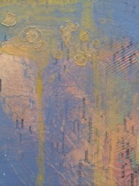
The benefits of layering our mixed media pieces are numerous. For starters, a rich history is built into the composition. Intrigue is created with areas that become partially hidden or obscured. Layering creates an interesting surface, one that is dynamic and deep. During the layering process, we can develop texture. Finally, a willingness to cover up our work allows for the unexpected….the happy accident. If we see each mark as precious, we tend to get attached to mediocre work and wonder why our art isn’t growing or why we can’t seem to get to the next level. The “next level” requires a fearlessness and ability to paint over, to abolish, to cover our work in a constant exploration of style, material use and composition development.

Remember, whether you are on your first layer or your tenth, there are many ways to get the paint on the paper:

  • Large brush blob with drips (hold up and tap on table)photo 2 (1)IMG_0267
  • Straw blowing or blow dryer
  • Scraper with paint
  • Sponge on paint
  • Splatter paint with toothbrush and paint brush
  • Medicine dropper or spray bottle
  • Drip painting

Building a pattern in at least one of the layers is a strong visual tool. Patterns can be implemented using countless methods, for example:

  • Use acrylic gel in paint and create texture and pattern (the gel will add body to the paint and then you can press a tool into the gel; for example, drag a comb through the gel to create a striped pattern)
  • Make or buy stamps to create pattern (ie the end of an eraser can be used to stamp a dot pattern)
  • Use stencils for pattern
  • Use language for pattern by handwriting, collage, stencils or image transfer
  • Tear painter’s tape into shapes, or use it “as is” for a bold stripe pattern

IMG_4975

IMG_0245

The student on the left is cutting out a tree shape from wallpaper to use as a stencil. In the piece above, the student made a hummingbird stencil and used painters tape to create pattern.


One challenge many of the students face after days of fearless experimentation, is their work sometimes lacks a focal point – a place for the eye to land. When critiquing, we often express a need to “calm down” certain areas of the painting or a need to guide the eye. There are many ways to resolve this issue when applying a final layer:

IMG_6515

“Dissolve II” by Raphaëlle Goethals

1. Paint over everything (students are often resistant to this suggestion but once you learn to paint over your work, you are set free!). You can use a semi-transparent paint layer so the marks and patterns underneath remain somewhat visible.

2. Along the lines of painting over everything, you can choose areas to save and not paint over. One way to do this is to lightly draw shapes where you do not plan to put the final layer of paint. Another way is to use a stencil or stencils to block out areas.

Version 23. You can also use acrylic gel medium to create windows to the layers underneath the final layer. Paint the gel medium thickly in whatever shape(s) you choose, let the medium completely dry, then paint over the entire piece. Using a damp rag or paper towel, wipe IMG_0262
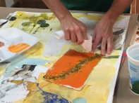
back the paint from the areas where there is medium and you will have created a window. If the paint dries and seems stuck to the medium, use a razor blade to scrape paint off, which creates an interesting texture. Other resists that are fun to try include candle wax and one of my favorites: rubber cement.

You can also create a focal point by adding a dominant feature such as a collage item, an image transfer, a pop of color, text, a bold mark…anything that stands out among it’s surroundings. While figuring out what to do for your focal point, consider the previously mentioned design element: CONTRAST.

For example, below on the left, Robert Rauschenberg pushes some of the collaged text back by painting over sections with a thin white paint. The inclusion of thick red marks among the neutral color palette allows the red to become a focal point. On the right, artist Sigmar Polke uses white to paint around a stencil among dark colors. While the white is transparent, allowing the patterns beneath to show through, it is still a strong contrast to the heavy colors. Additionally, the patterns are detailed and meticulous which contrast the organic application of the ethereal white layer.
DSC_0842thWhether your work includes representational imagery, or is purely abstract, learning to work with layers will provide you with a strong tool to develop intriguing compositions. Especially freeing is the idea that any marks can be covered, any mistakes can be altered or hidden. Once we learn this lesson with the use of layers, we are more willing to take risks, experiment, and push our work in a new direction. I hope you have enjoyed the mixed media blog series. If you are in Central Arkansas, please check out the Arkansas Arts Center schedule of classes by visiting: http://www.arkarts.com/

DSC_0997

Laura Raborn, “Mixed Messages,” 2015, fabric, image transfer, collage, acrylic, and oil on wood panel, 16×20″

Thank you for reading!

Laura

The Joys of Teaching Mixed Media: Part 4 Language and Letters

Raborn, “Notice,” 2014, acrylic and charcoal on panel, 25×25″

There are many reasons and ways to add language to our work. While teaching a mixed media workshop at the Arkansas Arts Center, I always wish we could spend more time on language, letters, and words.

DSC_0058

Raborn, “The Code Breaker,” 2015, mixed media on panel, 18×24″

Words can be the focus of the artwork, the complete purpose of the piece. Or words can be subtly buried within the work. We can add thoughts, names, lyrics, accomplishments, names of places, religious passages, historic quotes, dates, poems, all sorts of words. Words can be used to set a mood, or can be used to contrast something in the piece. They can be unclear and confusing; they can be mysterious. They can be filled with meaning or completely meaningless. Letters can be used to establish a pattern, where the letter loses meaning and is simply a chosen shape for the composition, as seen in the work of Robert Rauschenberg. Words can be borrowed from the media or from a product to reference popular culture. There must be countless motives to incorporate words into artwork; I’ve listed just a fraction of the reasons.

IMG_0243

detail of demo from Arkansas Arts Center workshop

If you are considering adding language to your work, here are a few methods. First, you can simply hand write on a painting. Try charcoal (use a spray fixative – even hair spray will work in a pinch), pencil, markers, paint….just about any mark making tool will work for handwriting on a water based paint such as acrylics or water color. You can also use all these mediums with letter and number stencils or stamps. Stencils and stamps produce a mechanical look with a hard edge which can be a stark contrast to loosely painted areas of a composition. Look at this Richard Prince piece (below) I had the joy of finding at the National Portrait Gallery in Washington, D.C. Notice the loose brushwork and monochromatic layers of paint. Notice the drips and the splotchy paint under the letters. The mechanical lettering highly contrasts the surrounding and underlying space which is a bit jarring for the viewer. Another contrast is set up conceptually: there is an odd humor among the dark palette. The disjointed messages are confusing and dark while simultaneously comical.

DSC_0966

Richard Prince, “In Morning,” 2002, acrylic and oil on canvas, 89×75″

photo 2 (1)

Detail from demo

Using collage by cutting letters out of old books, magazines or any printed material works well and is one of my favorite ways to add words, particularly when I plan to add more layers on top of the collaged letters. In the example on the left, I first glued color copies of a map on a gessoed canvas. After the glued paper was totally dry, I then added acrylic gel medium on top of the maps. While the medium was wet (and slightly thick), I raked a comb through the medium to create lined texture. After the medium dried, I painted over the entire piece with the light blue acrylic paint. In order to re-expose the map, I wiped back some blue paint with a damp paper towel (NOTE: in the last post of this workshop series, I will talk more about acrylic gel medium layers and about the yellow drippy layer).

photo(28)

Raborn, detail from “Mixed Messages,” 2015, mixed media on panel, 16×20″

Remember the recent post about image transfer? The transfer method is an excellent way to add language because the letters look embedded into the artwork instead of added on top.

While this sounds counter intuitive, I try not to think too literally when considering language in my work. I recall comments professor Taimur Cleary frequently made during grad school critiques. He pointed

Raborn, Untitled, 2014, acrylic and charcoal on panel, 32×24″

out that sometimes my marks resemble language. He allowed me to see the potential in creating marks that remind the viewer of letters and words but are meaningless (in terms of legibility). But the marks can still have a desired effect: making the viewer lean in and WANT to read the work. The IDEA of language as a form of communication can exist in a work without any actual letters or words! Following are two examples of the incorporation of words into paintings. They make it look so easy!

DSC_0842

Robert Rauschenberg, “Dam,” 1959

wool_w040.tif

Christopher Wool, The Harder You Look


If you’re still not feelin’ it and want to hear an inspiring lecture about the importance of words in every aspect of our lives, check out the TED Talk by writer Kelly Corrigan. It might initially seem unrelated to a mixed media workshop post, but opportunities like listening to Kelly’s talk is one of the many rudders that steers the direction of my artwork. I think you’ll find her inspiring, too.

http://tedxtalks.ted.com/video/More-Reading-Kelly-Corrigan-at

IMG_0103

Next up: You think you can’t draw? Oh, yes you can! We’ll review several approaches to drawing and how to include the drawn line in your mixed media artwork. Thank you for reading!  Laura


Hanging out with David Bailin, artist and drawing teacher extraordinare


The Joys of Teaching Mixed Media: Part 3 Collage

Confession: Until I started teaching a Mixed Media workshop at the Arkansas Arts Center, I failed to see the value in collage. In my mind, collage reeked of the 1970’s decoupage trend combined with my memories of glue sticks in the 1st grade.

photo 2

Laura Raborn, detail of Untitled (workshop experiment), 2015, mixed media on paper

I had a total change of heart during a recent workshop, when gluing images of women from a fashion magazine on a heavily textured painting. Like many of the methods I describe in this series of posts, collage works well in the layering process. Images can be altered to create or emphasize a concept that has no association with the original meaning of the collaged image. It is simply a tool to CONTRAST other marks in the piece or a tool to allude to an idea. In the example to the left, the female figure is barely visible, as it has been sanded, painted, and scrubbed. Once the eye finds the figure, it is as if a discovery has been made and the search for recognizable imagery among the abstraction and texture is part of the allure.

The tools you need are minimal: any type of glue (acrylic gel medium is my favorite) plus text, photos, magazine images, or whatever you can cut out and glue down. Remember, you can also appropriate from your own photos or artwork – just incorporate them into a larger piece. I’ve used my hand-drawn stencils as collage pieces and it is now one of my favorite techniques. In the painting below, can you see the strip of fabric that runs vertically on the right side? And the cut out male figure behind the girl’s eye? The collage item can be embedded into the painting and does not have to be highly visible or representational. It can help build the surface, establish a pattern, or support an idea presented elsewhere in the piece.

16 x 20"

Laura Raborn, “Girl Looking Outward”, 2015, mixed media on wood panel, 16 x 20″

IMG_4803As I’ve stated about many mixed media methods, collage is a method that CONTRASTS hand drawn or painted areas. This juxtaposition makes engaging composition. Take for example the work of Tyler Hildebrand, seen here on the left. The highly recognizable Waffle House signage contrasts the childlike drawings. Had the Waffle House sign been hand drawn or painted, the acute idea of American food signage would be diminished. The collage material makes the viewer go back and consider the sign again and again.

IMG_4805
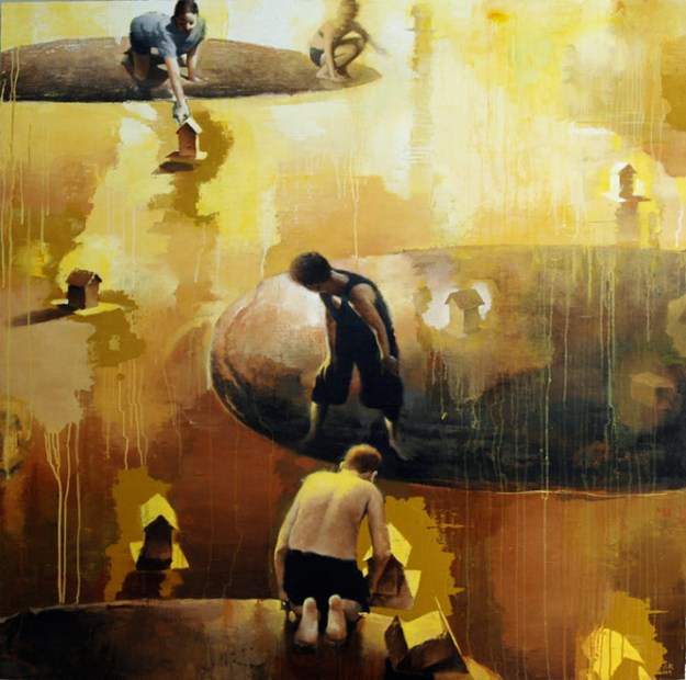
In another Hildebrand painting, the artist uses a drawing from his childhood and with painted line, tethers the drawing to the bulbous male form. Including the actual paper drawing in the composition conveys history. It doesn’t just allude to keepsakes – the dinosaur drawing on notebook paper IS a keepsake. The collage item encourages the viewer to ponder ideas about memory or childhood experiences traveling with us throughout adulthood.

When considering various images to appropriate, remember the collage item(s) can become your surface under other media, as seen in the work of German artist, Sigmar Polke. Seen below, Polke draws scenes and uses stencils on top of fabric swatches. If you are a mixed media artist, it would be worth your time to further investigate the work of Sigmar Polke. As an experimental painter and photographer, he brilliantly used all of the techniques (plus some) we explore in the mixed media class at the Arkansas Arts Center – including image transfer, the use of language, collage, stencils, stamps, drawing, layers, patterns and textures. He was ferociously experimental with all materials, allowing for the accident to coincide with concept.

Lastly, another effective way to alter the meaning of the original collage item, is to merge photos in order to create something else altogether. Is there something you are passionate about but feel unable to convey through painting and drawing? Communicate your ideas through a creative fusing of photographic imagery. Let’s say my goal is to create a piece about sea turtles and human activity. After printing photos I found online, I am playing with various combinations (please note this is not a well thought out example – just a moderately successful demo):

photo 4 (1)photo 3photo 1photo 5

Searching for photos online to fit the sea turtle idea, and trying to guess about scale while printing was fairly time consuming. Many collage artists  keep organized files to store interesting images they come across in the mail, catalogs, magazines, and any other printed material. Then they just search their own categorized files when starting a project. Artist Holly Roberts does an excellent job explaining her process – and her work is inspirational for those trying to learn more about collage.

To see her work, visit http://www.hollyrobertsstudio.com/
For a short informative video about her methods, visit: https://www.youtube.com/watch?v=Z5dqxGVI4sA

Next up in the mixed media workshop series: Incorporating text and language into compositphoto 2 (1)ions. Until then, thank you for reading….and a Happy Healthy New Year to all!