Tag Archives: paintings

Spring Break in NYC: Art Nirvana

In a time when art is more loosely defined than ever, where there are no limits to what materials artists use, where anything imaginable can qualify as art, and where idea sometimes trumps craftsmanship, I return home from a trip to New York City electrified and inspired. Only in David Zwirner did I wonder, “What the?” Having said that, I know my personal lack of understanding an art installation does not reflect poorly on the art; perhaps it is my limited exposure to certain materials or styles that leaves me perplexed. My own education or perspective could be the problem.

While visiting roughly twelve galleries and four museums during my daughters’ spring break, I was repeatedly delighted by the quality, talent, and thoughtful presentation. For this trip, I focused on painting exhibits and found that representational painting, much of which was figurative, dominated the walls. One reason I paint representationally is because I believe art is most powerful when the highest number of people can glean some understanding, some insight, some information about a subject presented. Art made for an exclusive few seems to deny itself the chance to speak clearly about culture, about society, about life and about issues in a way that can eventually serve as documentation of our time. But maybe art does not have to represent anything specific. Maybe odd installations tell of a need for something real, three dimensional, touchable, formidable in a world inundated with visual imagery. Yet I can hardly resist the allure of a two dimensional painting or drawing that serves as a magical window to an idea. Yes, two dimensional work is an imitation of something, it is a copy. But the flat plane can reach our minds, our emotions, our thoughts. A great painting or drawing feeds, informs, opens, provokes, teaches, records and delights us.

Following are a few highlights from our visit:

IMG_0565

Alyssa Monks, Become, 2015, oil on linen, 50 x 80 inches

Alyssa Monks at Forum Gallery. I expected to feel disappointment over her departure from water paintings. However, the current body of work, “Resolution,” is stunning and exquisitely painted. The artist merges the human form with forest and plant environments. While the figures embody large swaths of canvas, they do not dominate the space. Instead, towering trees and foliage promote the idea of humans as secondary to earthly growth. The paintings allow us to see the intertwined existence of all living things. Combining human features with elements from nature is difficult and looking closely at the paintings shows how the artist chose certain brush marks and colors. The Forum Gallery website allows viewers to zoom in on the brushstrokes which is helpful and revealing.


IMG_0562

Claudio Bravo, Morocco Triptych, 2009, oil on canvas

Claudio Bravo at Marlborough Gallery. For years I have tried to figure out what exactly draws me to the entrancing work of Bravo. He is able to arrange material in a way that encourages the viewer to imagine how the material folds and feels. He is a master of value, creating shadows, highlights and folds that become almost linguistic. The contrasting colors he often uses prompt the viewer to repeatedly return to the work. Though it is often the human figure that draws me to a painting, Claudio Bravo’s still lifes reveal a vision and skill that is always worth studying in person when given the opportunity.

big-black-hat-after-gainsborough-60-by-48

Rimi Yang, Big Black Hat After Gainsborough, oil on canvas, 60 x 48 inches

Rimi Yang at Stricoff Fine Art. I first fell in love with her fantastic layered work while studying my aunt’s fine art collection several  years ago. Since then, I have found Yang exhibited on the east coast, the west coast and in between in Austin, TX. Rounding the corner of 11th and 25th in Chelsea, my eye landed on this painting (here on the left) and I immediately knew I’d once again found one of my favorite artist’s work. As I struggle, sometimes failing and sometimes succeeding, to paint the figure in an abstracted space, I think often of Yang’s  ability to create mysterious settings that allude to history, time, and things being covered, or painted over or washed away. I LOVE her precision used only sparingly and how it contrasts with loose brush marks and drips. I LOVE the exquisite details that contrast undefined areas. She makes it look so easy and it certainly is not. I was grateful this painting caught my attention because it turns out Stricoff Fine Art also carries many artists I admire such as Carol O’Malia and Joshua Bronaugh. We hit the jackpot! As a bonus, I got to meet gallery director, Michel Vandenplas, who was very kind even though my girls were basically sprawled out napping on a couch toward the back and I’d taken a photo of a Yang painting which I learned was not permitted. Despite all this, he was completely welcoming and gracious. Sometimes, when the details of a busy trip fade into the past, it is the kindness of strangers that stays with us. Speaking of a welcoming and kind stranger, next up…

Garvey Simon Art Access. When submitting work for the Delta Exhibit at the Arkansas Arts Center, I read about this year’s juror, Elizabeth Garvey and was excited about the possibility of meeting her and seeing her gallery. Though we had no appointment and just stopped by to say hello, we were warmly welcomed. Liz graciously guided us into her office to show the work of many of the artists she represents. What first struck me in glancing at the walls was the pattern created by the wide variety of artists and their meticulous high quality use of materials.

c1c121be4be8f12c4203a8edf3d380cc

David Morrison, Stick Series No. 12, 2015, Colored pencil on paper, 14 5/8 x 21 3/4 inches

Much of the work on display was abstract forms from nature. Much of the work took something recognizable from the world and zoomed in for a hyper close view which helps viewers let go of the meaning of the things presented and see things in a new light. Ever since hearing Hank Willis Thomas speak about his work,  I deeply appreciate art that helps a viewer let go of a preconceived notion and see something in a new way. I was particularly drawn to the work by Julia Randall who shows us a view of life, of the human mark, of the fragile moment, in ways we surely have not considered. Her close look at various subjects – dead flowers, billowing empty plastic bags, chewed bubble gum – each involve air in one way or another. Not air that gives life, but air that is used and old. Whether the human form appears or not, the idea of a person involved with the item is ever present.


MF-124-time

Time, 2006 Oil on Panel, 36″ x 36″

Gallery Henoch. Finally, I was delighted to find Gallery Henoch, which has been in business for 50 years representing realist artists such as David Kassan, Burt Silverman, Daniel Greene, and Max Ferguson. For four years, I’ve regularly visited Crystal Bridges Museum of American Art and never tire of the painting, “Time” by Max Ferguson. Though I did not get to see Ferguson’s work during our visit, the majority of the work on display was by Gary Ruddell. He creates a space for the figures that presents the idea of fantasy, or memory, or the world of youthful imagination. The looming deep shadows contribute to a slightly eerie or dangerous atmosphere though the figures seem content in frozen playful gestures. With backs turned away and eyes cast downward, there is something unreachable about the worlds in which the figures exist. I am grateful to have found another artist to admire who can create evocative compositions using semi-realistic spaces for figurative work.

GR-188-Small-Journeys

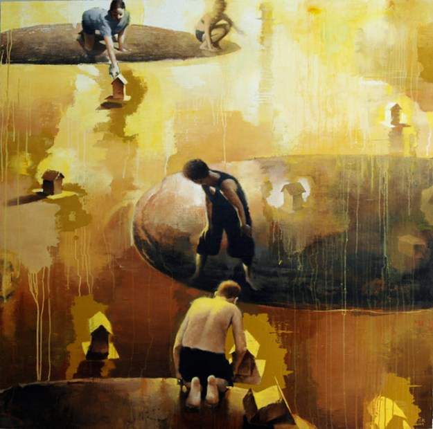
Gary Ruddell, Small Journeys, Oil on Panel, 54″ x 54″

GR-186-Pinball-Cha-Cha

Gary Ruddell, Pinball Cha Cha, Oil on Panel, 60″ x 60″

There were so many more inspiring exhibits but this post is getting long…below are photos from our wanderings at the MOMA and the Met. Thank you for reading!

Laura

DSC_1025

Robert Motherwell

DSC_0926

Takashi Murakami

DSC_0920

Cy Twombly

DSC_1038

Jim Dine

DSC_1041

George Condo

DSC_1036

Robert Rauschenberg

IMG_0591

Francisco de Goya

DSC_1043

Philip Guston

DSC_0914

Jean-Michel Basquiat

IMG_0580

Jasper Johns

DSC_1033

Joan Mitchell

DSC_1045

Ferdinand Hodler

DSC_1029

Willem de Kooning


Capturing Lost Moments and Memory through Painting

DSC_0604While I am compelled to paint, the two dimensional art form can feel limited at times. The ideas dominating my thoughts, the concepts I aim to convey, they may need smell, touch, or sound to complete the message. Can I instill with paint the feel of the cool air at dusk upon the skin? Can I lead a viewer to smell the musty ocean scent of saltwater and fish and damp ground? Can a painting evoke sound for the viewer? I wonder how limited or how powerful a visual prompt can be. In a world more saturated with visual imagery than ever before, I begin to realize a two dimensional image can penetrate the mind, can influence beliefs, can alter opinion and evoke specific emotion. The visual image can make us IMAGINE using our other senses. Ceaseless advertising in our lives proves the power of an image.

"Disappearing Act", 2016, oil on canvas, 18 x 24"

“Disappearing Act”, 2016, oil on canvas, 18 x 24″

Perhaps I can reach the minds of a few viewers and create art that connects directly with unique memories and experiences of others.  I strive the instill that feeling of nostalgia, of the past, of a closed unreachable history…the bittersweet yesterday that lives only in our memories. Can I accomplish such a poignant feeling of a lost moment in time? Well, in two new groups of paintings, I certainly try.

In one group the focus is on place – the type of place that fades over time, that succumbs to nature. Conversely, I also depict places that seem to never change…that stay fixed in both our memory and by some miracle, fixed in a landscape. These places beat the odds. While generations of people come and go, these places resist nature and resist slipping into the past. The second group I’m now working on are people who are part of a place and the place is part of the people. The two intertwine and co-exist, each influencing the other. The painting below exemplifies my effort to mesh a person with a place and a place with a person.

"Transcendence", 2016, oil on canvas, 16 x 20"

“Transcendence”, 2016, oil on canvas, 16 x 20″

Environments remain, sometimes altered by the presence of a person, but largely ambivalent to our short existence. We build things, create structures, make objects that we leave behind for the next person to find and use. Our time is short and noticing our surroundings is important, noticing the things we make and use is worthy, noticing our fleeting moments with each other is valuable. Stopping and noticing, even while it all passes so quickly, is a way to freeze time and be thankful. I suppose this is both why and what I paint.

"Connected", 2016, oil on prepared paper, 22 x 30"

“Connected”, 2016, oil on prepared paper, 22 x 30″

Thank you for visiting! Please comment if you have any feedback or questions. Next up: Scoping out art trends in New York City!


The Joys of Teaching Mixed Media: Part 4 Language and Letters

Raborn, “Notice,” 2014, acrylic and charcoal on panel, 25×25″

There are many reasons and ways to add language to our work. While teaching a mixed media workshop at the Arkansas Arts Center, I always wish we could spend more time on language, letters, and words.

DSC_0058

Raborn, “The Code Breaker,” 2015, mixed media on panel, 18×24″

Words can be the focus of the artwork, the complete purpose of the piece. Or words can be subtly buried within the work. We can add thoughts, names, lyrics, accomplishments, names of places, religious passages, historic quotes, dates, poems, all sorts of words. Words can be used to set a mood, or can be used to contrast something in the piece. They can be unclear and confusing; they can be mysterious. They can be filled with meaning or completely meaningless. Letters can be used to establish a pattern, where the letter loses meaning and is simply a chosen shape for the composition, as seen in the work of Robert Rauschenberg. Words can be borrowed from the media or from a product to reference popular culture. There must be countless motives to incorporate words into artwork; I’ve listed just a fraction of the reasons.

IMG_0243

detail of demo from Arkansas Arts Center workshop

If you are considering adding language to your work, here are a few methods. First, you can simply hand write on a painting. Try charcoal (use a spray fixative – even hair spray will work in a pinch), pencil, markers, paint….just about any mark making tool will work for handwriting on a water based paint such as acrylics or water color. You can also use all these mediums with letter and number stencils or stamps. Stencils and stamps produce a mechanical look with a hard edge which can be a stark contrast to loosely painted areas of a composition. Look at this Richard Prince piece (below) I had the joy of finding at the National Portrait Gallery in Washington, D.C. Notice the loose brushwork and monochromatic layers of paint. Notice the drips and the splotchy paint under the letters. The mechanical lettering highly contrasts the surrounding and underlying space which is a bit jarring for the viewer. Another contrast is set up conceptually: there is an odd humor among the dark palette. The disjointed messages are confusing and dark while simultaneously comical.

DSC_0966

Richard Prince, “In Morning,” 2002, acrylic and oil on canvas, 89×75″

photo 2 (1)

Detail from demo

Using collage by cutting letters out of old books, magazines or any printed material works well and is one of my favorite ways to add words, particularly when I plan to add more layers on top of the collaged letters. In the example on the left, I first glued color copies of a map on a gessoed canvas. After the glued paper was totally dry, I then added acrylic gel medium on top of the maps. While the medium was wet (and slightly thick), I raked a comb through the medium to create lined texture. After the medium dried, I painted over the entire piece with the light blue acrylic paint. In order to re-expose the map, I wiped back some blue paint with a damp paper towel (NOTE: in the last post of this workshop series, I will talk more about acrylic gel medium layers and about the yellow drippy layer).

photo(28)

Raborn, detail from “Mixed Messages,” 2015, mixed media on panel, 16×20″

Remember the recent post about image transfer? The transfer method is an excellent way to add language because the letters look embedded into the artwork instead of added on top.

While this sounds counter intuitive, I try not to think too literally when considering language in my work. I recall comments professor Taimur Cleary frequently made during grad school critiques. He pointed

Raborn, Untitled, 2014, acrylic and charcoal on panel, 32×24″

out that sometimes my marks resemble language. He allowed me to see the potential in creating marks that remind the viewer of letters and words but are meaningless (in terms of legibility). But the marks can still have a desired effect: making the viewer lean in and WANT to read the work. The IDEA of language as a form of communication can exist in a work without any actual letters or words! Following are two examples of the incorporation of words into paintings. They make it look so easy!

DSC_0842

Robert Rauschenberg, “Dam,” 1959

wool_w040.tif

Christopher Wool, The Harder You Look


If you’re still not feelin’ it and want to hear an inspiring lecture about the importance of words in every aspect of our lives, check out the TED Talk by writer Kelly Corrigan. It might initially seem unrelated to a mixed media workshop post, but opportunities like listening to Kelly’s talk is one of the many rudders that steers the direction of my artwork. I think you’ll find her inspiring, too.

http://tedxtalks.ted.com/video/More-Reading-Kelly-Corrigan-at

IMG_0103

Next up: You think you can’t draw? Oh, yes you can! We’ll review several approaches to drawing and how to include the drawn line in your mixed media artwork. Thank you for reading!  Laura


Hanging out with David Bailin, artist and drawing teacher extraordinare


Struggling to Convey Certain Ideas Through Painting: The Influence of Beautiful Writing

IMG_0118_2Sometimes we yearn for something, for a person, or education, for an experience, or travels, for a rest or a new skill. If we can identify what it is we so desire, sometimes that very thing arrives. And when it does, it feels like a little miracle, appearing at the exact moment you need it most.

This happened one week ago, as I read the New York Times article, “The Ghost House of My Childhood” by Alan Lightman. His description of specific objects leads me to think of him as a visual artist, in addition to being a writer and physicist. His each and every word – a brushstroke or mark, an outline or shadow. He creates visual images in the reader’s mind that demand we see the objects in his memory. His words create simple visual cues leading us to understand complex ideas, such as the line, “My body is a distant, cold moon” which he stated when discovering his childhood home had vanished.

I realize most writers are masterful at choosing  words to create visual imagery for readers. In this case, the images and ideas presented by Lightman happen to perfectly match the ideas I aim to convey in my paintings. I’ve yearned for this very article. The imagery he creates with precise words helps me learn how to better paint the ideas I’ve considered for the past two years.

DSC_0974The author helps readers understand that once things are gone, the only evidence of the past is in our minds. “And on the ground where the house was, new grass. Not a single brick or splinter or piece of debris.” Inspired by Lightman’s article and his eloquent words, I spent the week in my art studio continuing to dig at ideas: composing work that shows the figure in a space or setting indicating the lost past, a history, and the idea of memory defining us and binding us. While painting, I consider the past is only in our minds and that everything we think and see is partially “real” and partially “imagined.” While I struggle to achieve and communicate these ideas in my paintings, this week I moved a bit closer thanks to Alan Lightman. DSC_1000

He writes of memory and of neurobiologists’ description of memories. This painting (here, to the right) positions the figures with abstract shapes that interrupt, cover, and participate with the figures. The circular forms are like the flowing molecules Lightman refers to when describing our ever-shifting memories and perception of the world.

The two paintings below allude to several ideas: the view that every life is fleeting, that everything we look out and see is a partial image altered by perception, that all things fade as time passes, and that our experiences and perceptions are layers obscured over time.

DSC_0991DSC_0996 2


The author’s handling of air immediately struck me as powerful and ignited specific methods I can try in painting. Of air, he writes, “I slide through the air,” “I can see right through the empty air,” “The air had a stillness it never had before,” “but there is only the silent, dead air,” and my favorites because of the unorthodox combination of words, “this empty corner of air,” and “I can see through the slab of air.” I’m not sure how I could paint these exact examples or if I even want to try, but they teach me that when something is missing or gone, what remains is more than nothing. The missing thing or the faded history is replaced by a vacuum so tangible, so acute in the mind of the memory holder, that saying the space is empty or only full of air, is not enough. A “slab of air” evokes the expression, “slab of concrete” which is something so solid and something Lightman yearns to see. In fact, of the former house he writes, “I try to will it into solidity.” The use of the word “slab” makes us hyper aware of what is missing. Perhaps this is what I find so enthralling about Lightman’s writing – the startling inversions he creates cause the reader to truly sense what he is experiencing.

One of the most beautiful as well as haunting passages in the article is when Lightman writes, “Some philosophers claim that we know nothing of the external world outside our minds – nothing compared to what sways in our minds, in the long, twisting corridors of memory, the vast mental rooms with half-open doors, the ghosts chattering beneath the chandeliers of imagination.” Now that image could make a great painting, a painting that resonates like the well chosen words of Alan Lightman.

Thank you for reading. Please reply if you have any comments to add to these observations.
Until next time! Laura Laura art 1


Gallery Hopping In Nashville, TN

While planning a road trip from Little Rock to Arrowmont School of Arts and Crafts in Gatlinburg, TN, I noticed a perfect opportunity to stop over in Nashville where I could visit the growing list of cool art galleries, as well as visit a dear college friend. IMG_6101Staying overnight both Friday and Saturday, thanks to my kind hosts, allowed plenty of time for multiple stops. More importantly, and quite unexpectedly, we were able to spend quality time in the galleries, where owners and sales people were professional as well as encouraging, even when I mentioned my interest in gallery representation.

One of our most delightful surprises and longest stays, was at the Bennett Galleries where we were immediately greeted by Emily Cothran. Upstairs there is a frame shop, though this is a fine art gallery with many long established art contacts – from well known artists to top decorators to savvy collectors. The art styles represent a range including figurative, landscape and abstract. Though there is a wide variety, there is also a common larger theme: provoking, interesting, high-quality work.

IMG_6082The surprise came as we stood at the top of the stairs admiring a large abstraction that included random bits of architectural and figurative drawings embedded in the layers. This painting did what I most love…it gave the viewer the opportunity to discover and imagine. The longer we stood gazing at the heavily textured surface, the more information was revealed. The only problem was that the painting was hung in a position that was difficult to see closely. I suspect the layered surface, created with paint, pencil or charcoal, and fabric, would continue to delight upon closer inspection. MylesBennett-Affair16onWorktable-mixedmediaoncanvas-61x64

As we stood discussing the piece, Emily explained the artist, Myles Bennett, attended the Rhode Island School of Design and now lives and works in Brooklyn. At that moment, a young man strolled up as if on cue…it was the artist himself! Unbeknownst to Emily, Myles was visiting Nashville for a few days. When deeply appreciative of a specific piece of art, it is always a treat to meet the artist and hear his or her thoughts. We had the pleasure of talking with Myles about his work, education, family, and all sorts of topics. What perfect timing!frothy-monkey-12-south

After a quick coffee at the Frothy Monkey in the hip “12south” neighborhood, we headed downtown to The Rymer Gallery, The Arts Company, and Tinney Contemporary. Like many artists thinking about how technology is changing our lives and changing how we relate to each other (for both better and worse),Seduction 1 John Jackson I am always excited to see this topic tackled and was delighted to find the provocative paintings of John Jackson currently hanging at The Rymer Gallery. Many of his pieces incite thoughts about technology’s influence on intimacy as well as what we view as “real.” The space at The Rymer Gallery is clean and open, which creates a calm environment and allows a deceptively large volume of work to hang without feeling crowded. We then moved a few doors down to Tinney, which was closed due to the installation of a new exhibit.

The tour would not have been complete without a visit to the ultra avante garde art space, Zeitgeist, where we were fortunate to meet contemporary multi-media artist, Lain York. lyonkunown(frommainroom)912 He  showed us his work made of vinyl strips which led to a discussion about the expanding definition of art and potential art materials. As Lain spoke, I thought of the recent “State of the Art” exhibit at Crystal Bridges Museum of Art (for more information, scroll down to see earlier blog post) and how the exhibit presented to the public a show in which there were almost no limits on materials used in today’s art. To many, it was baffling, and not necessarily art, but to artists, the show was ground-breaking validation. And before I could ask, Lain mentioned his awareness and appreciation of the Crystal Bridges exhibit.yorkfairfax3215

Zeitgeist represents a variety of artists. My impression after visiting the converted warehouse is that the space provides a place for artists who are combining mediums and art forms (for example, think of dance, film, light, and sound combined to create a performance piece), who are experimenting with materials, and who are successfully communicating ideas through alternate uses of materials. This is a place to visit, and think, and learn. Thanks to Lain, we were educated about several of the represented artists, about recent exhibits, and about the purpose of the space.

In thelcg-open-outside-1218x360 mood for a scenic drive, we decided to head to historic Leiper’s Fork to visit Leiper’s Creek Gallery. I’d communicated with owner Lisa Fox through email years ago and was excited to meet heMel Rae Hear-and-Their-18x18-encaustic-2014r and talk about her art and the artists she represents. Warm and welcoming, Lisa told us about the gallery, about the historic area and surrounding businesses and about several of the artists. It was well worth the drive (which was stunning in the afternoon light) and a nice complement to a busy day in the city.

Because of meaningful conversation and contacts made at each gallery, it turns out a full day in Nashville wasn’t quite enough time to visit each gallery on my list. I’ve got another list going for next time with Cumberland Gallery at the top, followed by Tinney Contemporary. I would also love the visit the tiny space called “Nashville’s Smallest Art Gallery,” which according the the website, “measures a miniscule 27 inches wide by 37 inches tall, but has been attracting the work of top artistshow-thumbs from around the US world, and local Nashville artists alike. In a former life, the gallery was a neglected, graffiti-covered display case. Soon with a little help from some Goo Gone, a razor blade, and a total interior makeover, the gallery started to take shape, and on March 15, 2008 NSAG was born.” Seriously? How cool! Perhaps my next visit can coincide with the art walk, which I hear is quite a scene. Thank you to all the fine folks in Nashville’s art galleries, and a big thank you to my kind hosts, Chuck and Tony.

And thank YOU for reading! Next up: An enriching experience in so many ways at the world renowned Arrowmont School of Arts and Crafts.IMG_0074_2

Part Two: A return to Harbour Island with visions of art

It is hard to imagine how art could possibly capture the essence and beauty of Harbour Island, a tiny slice of heaven off North Eleuthera in the Bahamas. While sketching and photographing during a recent visit, I realized there are countless images and ideas that could be conveyed with drawing and painting. Abstractions could aim to capture the onslaught of brilliant light and color. The abundant foliage could make a limitless subject for botanical themed work. As a figurative artist, the temptation to capture the beauty and kindness of the people is irresistible.

IMG_5962  IMG_5957  IMG_5867  IMG_5872

But I can’t seem to escape the ideas mentioned in Part 1 (the previous blog entry) about the visual cues of time passing, and sometimes standing still, and of history, and of nature always altering, and reclaiming and continuing with or without us. So I’ll use images that prompt us to go back, to see the past, to wonder about our memories and the time before us. Perhaps in a strange combination, I can evoke the past while presenting figures who now have their turn at this magical place in the present.

DSC_0698   DSC_0694   DSC_0243

DSC_0579   DSC_0164   DSC_0782

One way to sort through the ideas and options is to seek inspiration in the work of others. Luckily, there is an fine art gallery nestled amongst the cottages and business in town. Upon entering the Princess Street Gallery, one quickly becomes aware of the talent – from both local and international artists – behind the poignant drawings and paintings. DSC_0451The work includes a variety of styles and subjects ranging from landscape to figurative. The overall impression when entering the space is much like the visual impression of the island – both the art and the island present breath-taking beauty, vivid color, creative patterns and vibrant people.

DSC_0443Though he was busy preparing for a customer meeting, owner Charles Carey gave me a few minutes of time to talk about his business. After growing up in Nassau and working in New York City, Carey relocated to Harbour Island and noticed “numerous artists on the island creating work with no where to show it.” With the grin of someone who loves his job, he explained that opening the gallery “was an experiment, really.” Nineteen years later, I’d say his experiment produced success for Carey, for the artists on his roster, and for collectors.

I was particularly drawn to two artists whose approaches, style, and subject matter seem to be opposite of each other, yet each artist captures a deep truth about island life. Native Bahamian and former house painter, Amos Ferguson uses repetition and bold shapes to create recognizable imagery in an abstracted environment full of color, texture and pattern. ferguson_polkadots330 His ferguson_longleglizzie330work is immediately delightful, and on closer inspection, viewers notice a narrative or deeper meaning behind the deceptively simple figures. While the paintings can be perceived as child-like, don’t be fooled. The compositions are masterful and indicate a natural talent and gift.

I first saw the work of Stephen Scott Young in a private collection,DSC_0446 the same collection that inspired me to study figure painting in grad school. So it was a meaningful treat to view several pieces displayed at Princess Street Gallery.  His ability to perfectly execute anatomy, from expressive faces down to each carefully placed finger and toe, is unrivaled amongst watercolorists. But it is the choice he makes in the details, guiding our eyes and thoughts, that describes the mood, character and lives of the figures with brilliant clarity. He shows us the outside of stephen scott youngeach person as well as the individual spirit and circumstance which is perhaps one reason for his international success.

As I search for a way to present people, define space, and share the spirit of this place, I think of other artists and their methods. Those at Princess Street Gallery show me capturing the essence of Harbour Island is possible. The opportunity to spend time here, a place of lush growth, crystal clear water, and deeply kind people is a delight for anyone and a visual cornucopia for an artist. Creating meaningful art to represent such a magical place is a challenge for which I am deeply grateful and ready to face. Perhaps next entry, I’ll share a few pieces from current painting efforts. Until then, below are are few early sketches.

I hope you are having a lovely summer. Thank you for reading!

Laura

IMG_6031


Michaël Borremans’ “As Sweet As It Gets” is darkly delicious

A trip to deliver a painting to the Irving Museum of Art quickly took a turn in purpose when I read about an event at the Dallas Museum of Art. An exhibition by Belgian artist, Michaël Borremans, was scheduled to open and I have admired his work for years. In my graduate thesis, I wrote about the influence of one of his paintings, Four Fairies, in my work and yearned to see his work in person as opposed to only viewing paintings online and in bofourfairies_borremans3oks. Learning about the exhibit made me deliriously happy, and then came the icing on the cake…the artist would be present for a “conversation” with the show’s curator and all I needed was a ticket to attend. WAIT A MINUTE. I could sit right in front of an international superstar, one of my all time favorite living artists? For 5 bucks?

Juggling work with motherhood can be challenging…I’m often riddled with guilt when choosing work or an art related activity over spending time with my precious daughters. However, I almost never leave town without them, and I schedule my studio time around their schedules. Surely one quick trip to Dallas was acceptable, right?

Here is the information I found when researching March events at the Dallas Museum of Art: “The DMA hosts the United States premier of the internationally traveling exhibition Michaël Borremans: As Sweet as It Gets, co-organized by the Dallas Museum of Art and the Center for Fine Arts, Brussels (BOZAR). The exhibition brings together the artist’s paintings, drawings, and films from over the last fifteen years in a single survey. Join contemporary Belgian artist Michaël Borremans in conversation with Dr. Jeffrey Grove, curator of the exhibition and the DMA’s former Senior Curator of Special Projects & Research, for insights into Borremans’ life and work.”

After about 30 seconds of consideration, I purchased a ticket and knew I would somehow get there. Those with a ticket for the artist talk could also get a sneak peek of the exhibit two days prior to the official opening. This was truly as sweet as it gets. Making the quick trip even more fun (and economical) was a childhood friend’s offer to let me stay overnight.

At this point in my career, listening to a great artist speak about his work, process, inspiration, and use of materials, is a vital boon to my ideas and work. And if that sounds dramatic, I will use an example provided by the artist himself during the conversation. He spoke of Goya, and of seeing Los Caprichos as a teen. The moment he saw the etchings, something in him shifted and his ideas for his future were altered.393px-No_te_escaparas - Goya - Los Caprichos los_caprichos_de_goya_f_010

Artistic influences profoundly shape an artist’s life and work. I find art’s extreme power to influence is difficult to describe. I, too, am influenced by artists and by Goya in particular. When studying art history in Madrid as a 20-year-old college student, I visited Goya’s work at the Prado. The paintings, both those with disguised darkness and those with overt malevolence, luresaturn_devouring_his_sons-larged me in and pushed me away. I’ve never been able to shake the power those paintings held over their viewers. Since then, I see the work of Goya at every opportunity, which is rare, as I do not travel often beyond the United States. But I did get to see those etchings, Los Caprichos, in Santa Fe, NM last year and the genius of Goya startled, scared and bewildered me again. His ability to capture the human condition – both the comedy and the darkest of human behavior – is unparalleled. Perhaps this partly explains why I am drawn to the work of Borremans. He simply presents complex and dark insights to being human. His paintings are alluring, confounding, disturbing and provoking, in a beautiful and violent presentation.

Before I share more about the artist’Borremans - the whistlers comments, let me take you on an abbreviated tour of the exhibit. Not to boast, but I do believe I was the first visitor allowed in…okay, I was a little too excited, but what the heck, it’s fun being passionate and eager. Anyway, upon entrance, I accidentally rushed through the first room, wanting to be alone for a moment. As a longtime admirer of Edouard Manet, I first noticed a piece titled, The Whistler, 2009, which is reminiscent of ManeManet the Fifert’s The Flute Player, 1866. The body position and brushwork between the pieces are similar but Borreman’s painting is darker, not just in hue, but in mood, in message.

Injury to the body is common in his work. There are burns, lacerations, detached body parts and truncated torsos in impossible positions. Often, when my eye could detect no injury, there were aggrieves marks such a rude stab by the paintbrush to the eye in Colombine, 2008.Borremans - colombine

The figures should look uncomfortable but their downcast faces appear neutral, lacking any expression or response to the awkward position, or injury they display. It is as if the people in Borremans’ paintings become objects, and are dehumanized conveying a dark message about being human. Many of the figures are painted in the same tones as the background space making thBorremans - figurinee bodies appear to be the same importance, or the same substance, as their surroundings. I also immediately noticed several paintings of seemingly simple objects. A branch, a mask, a toy, figurines. Whether these objects stand alone in a painting or are presented with human figures, they dominate the space.

For example, in Man Wearing a Bonnet, 2005, an inversion exists where the man becomes a prop used to display a bonnet. The bonnet is oddly alluring with floppy little ears built in and various paintings of the same subject provide multiple views of the bonnet. Is this what deconstructionists do with writing? Strip away meaning, take apart notions, and flatten ideas and impressions so there is nothing remaining but a deep truth found only in nothingness? And exactly what is the deep truth expressed by Borremans? Even after closely listening to the artist speak about his work, I have no answer to that question. Perhaps not knowing is part of the delicious appeal.Borremans - bonnet

I am attracted to the figurative work of Michaël Borremans for many reasons. His paintings are simple yet become complex upon further thought. They prompt the viewer’s mind to unravel a tangle of ideas, often too dark to consider closely. They are beautifully executed – his drawing skills are superb and his brushwork, paint application and color palette are the strangest mixture of calming and energizing, both luscious and void, both warm and cold. Describing the work of Borremans is a process of using contradictory language, rightly so. In case you are confused, let me provide an example. Many of the figures are in positions indicating they could be dead. However, the artist’s use of rich warm tones in the skin indicates blood flow and vivaciousness. These confounding contradictions let viewers intuit something is not right.

After viewing paintings of various sizes in the first four large display halls, a shift in medium occurs with the display of a film titled, The Storm, 2006. The 35 mm grainy film is projected by a colossal piece of noisy equipment and the image on screen flickers. The Borremans-The-Stormambiguous flicker of light could be indicating a damaged or aged film reel or could indicate an intermittent loss of power in the mysterious scene – a room void of detail, purpose or time. The image of three seated men in the room is almost stagnant but the flickering lights and jumpy screen add a rhythmic quality. Though the men appear to be completely still, viewers perceive very slight movement, perhaps breathing, which makes viewing the one minute loop very different from viewing a still photograph that is flickering on a wall.

After the film, the exhibition is filled with drawings, three-dimensional models, photos, and films on small monitors mounted borremans - houseon the walls amongst drawings. Using pencil, watercolor and gouache on found paper and boards, we find lots of little heads and body parts, experiments with scale, repeated drawings of the same subject with varying views and settings, and the artist’s notes and handwriting. The sketches and notes provide some insight to the development of ideas, certainly more insight borremans - punishedthan is provided by the reticent paintings (let me clarify, it is their silence, and lack of answers that make the paintings outstanding amongst contemporary figurative art).

Often, viewers can recognize objects or bodies that appear in paintings earlier in the exhibit. For example, The Greatness of Our Loss is a sketch of two male bodies, which reappear in the painting titled, Two Bodies, 2005. Or a film, such as Add and Remove, 2007 shows a scene that reappears in nearby drawings. Worth noting is that three drawings, The Walk, Sunset, and Add and Remove were each created in 2002 and the film displaying the same shelves with miniature trees being added and removed was produced in 2007. It is as if the artist is borremans Add and removedigging away at the meaning of a thing, and at possible perception based on material and presentation. He explores body positions and objects with relentless agitation and circles back to previous ideas, forcing himself and viewers to look, and think, and look again, and think more – possibly over a long period of time – about a repeated image.

IMG_4540Having studied and copied (my attempt is on the left) the painting The Goldfinch, 1654, by Carel Fabritius, I was delighted by the simple painting of two bird specimens (titled 10 and 11, 2006) and curious about the artist’s slippery attempt to explain why he now paints from nature, something he previously declined. For the next entry, I will talk about Borreman’s brief Borremans birdsexplanation of how he chooses subject matter and several other insightful topics he discussed during the artist “conversation” with curator, Dr. Jeffrey Grove.

Until then, thank you for visiting!

Revisiting Italy…In My Mind and in My Work

DSC_0748Today’s post is a preview to my upcoming exhibit on display at Boswell Mourot Fine Art February 28 – March 5 and again March 21 – April 2, 2015. Upon completion of grad school, I briefly wondered what would drive me to create a body of work in addition to my commission business. The answer presented itself as I applied for, planned, and attended an artist residency in remote southern Italy. The experience provided enough inspiration to last a lifetime and fuel countless bodies of work.

So I see this show as a scratch in the surface, as a beginning to a lifetime of visually exploring ideas I’ve contemplated for many years, ideas that Italy poignantly highlights in a lavish display of architecture, art, sculpture, monuments, ruins, and relics. IMG_4053 DSC_0880DSC_0907 DSC_0381DSC_0087    DSC_1000


This body of work is an attempt to consider and communicate ideas. Specific themes surfaced repeatedly during my travel research: the passage or suspension of time; the strong influence of history in daily contemporary life; and, visual cues contrasting the ancient with the modern. For example, several paintings examine the presence and participation of inanimate objects (see below left image and consider the statue, the key, the chains underfoot, the cell phone, and the purse), such as religious relics and sculpture, in contemporary life. DSC_0755

In Italy, I began to see the omnipresent visual references to history as beacons of light. Details in stonework, in sculpture, in ancient relics and ruins allow the past to shine on contemporary life by guiding us with ancient clues, philosophy and lessons. This body of work examines visual evidence that seems to contrast modern life but actually surrounds, shapes and embodies today’s inhabitants of Italy. DSC_0742

Viewers of this new body of work can consider ideas about history in our their own lives. The work integrates figurative imagery with layers of text, pattern and drawings in a manner that both hides and reveals information, causing viewers to seek answers and ponder the abstracted space in which the figures exist. My hope is that the work invokes thoughtful contemplation for viewers, as it did for me during the creative process.

And if that all sounds like a bunch of artsy talk, take a look at the above painting and I’ll show you what I mean. I hope you will want to study the figures and ask, “Where are they? Are they together and do they know each other? What is their relationship? Is he in her past, present or future? What is that book in her hand? What is he writing? What does that text say in the background around the woman? Who are the faded figures and are they people in his mind, his memory? Is he writing about them? What are those architectural drawings fading into the background?” There are not always answers to these questions. The point is to consider the work, apply it to your own experiences and ask questions that keep you engaged in something, in anything! There is a Robert Rauschenberg piece at Crystal Bridges Museum and the label states his work is about “the effort of searching for meaning rather than specific meaning itself.” Look at the images in your world and in the art you see, and think. You might reconsider an issue on your mind, or see something in a new light. If my work can provoke this type of exploration, then I’ve had some measure of success.

Thank you for visiting! And please visit Boswell Mourot Fine Art in Little Rock, AR if you’d like to see the paintings in person.


A long awaited visit to the David Lusk Gallery in Memphis

IMG_4826After years of hearing about this gallery and admiring the artist roster from afar, I finally got to visit the David Lusk Gallery this past weekend. The two current shows, by artist Mary Sims and artist Tyler Hildebrand are great examples of the effectiveness of seeing art in person, as opposed to viewing online photographs of art. First, seeing the materials in both shows had a much greater impact on my perception and interpretation of the work. Second, viewing the work in person allows the size of the pieces, which are for the most part larger than life, to impact the viewer’s feelings and alter the relationship between the viewer and the presented figures.

Mary Sims angelThe vibrant work of Mary Sims (1940 – 2004) combines what appear to be conflicting images, mythology and historical references in the current show “Zuma and the Bible.” There is a tension between people, and perhaps between races, as figures appear to be either dominant or subservient in each composition. Religious iconography appears, such as the yellow halo (seen above in “Dream a Little Dream”) but the woman stares boldly out at the viewer, changing the mood from holy to defiant, as if she were being forced to dress up as an angel. Each painting contains multiple pointing devices moving our eye round and round, which is helpful, as there are details to discover with each rotation. For example, I initially somehow missed the tiny people at the feet of the woman in “Her Daddy Gave Her Magic” (below) and my awareness of the little figures completely changes my perception of the large central figure. IMG_4807

These paintings are full of tension and contrast: the rich colors contrast the messages of indulgence, power and dominance; the intricate patterns and fabrics reference multiple cultures; the clothing within each painting indicates various periods of time (see the Egyptian head dresses with the garter belt and high heels below); and the strange interaction between animals and humans is at times comical as well as disturbing (see the little dog in “Ship of Fools” below). Viewing the paintings of Mary Sims is a way to feel simultaneously uncomfortable, bewildered and mischievous. These are each works one could spend a lot of time with, as if the paintings could change and grow with a viewer. As an artist, creating imagery that prompts discovery and rediscovery for a viewer is a personal goal and is one that Sims acmary sims.potapher_cornutohieves with provocative panache. ms.ship_of_fools

Tyler Hildebrand, an artist based in Cincinnati, delights, surprises and then disarms viewers with his show, “Granny Whitey: New Paintings, Drawings & Film.” The tone is set upon entrance to the gallery with actual shag carpet covering the floor and the presence of an old television, chair and full ashtray in the center of the gallery space. Visitors immediately know that we are trodding in someone’s memories of 1970s Americana.

Many of the paintings combine some type of consumption to the point of harm with a comical edge. IMG_4804Perhaps it is the presence of a child like drawn line that gives the pieces a certain humor and light mood. Additionally, most of the paintings are on found objects such as imperfect cardboard and old Dunkin Donuts boxes. But then the thick, bludgeoned, and sometimes bleeding bodies present a dark element. All of the figures are distorted with either enormous, elongated necks or no necks at all and bulbous bodies that seem to expand in uncomfortable proportions. It is as if the heads (our brains) are shrinking and the bodies are expanding causing the gross destruction of ourselves and each other. th.bowieAs I reflect back on the paintings, my smile at the quirky details fades and I realize how many of the pieces have hitting, bleeding, and fighting. For example, there are multiple images of guns, in collage style application or childish drawings. See the piece titled “Bowie” (here to the right): why does the man in bed have a machine gun? And what to make of “Wastin Away Again” (below)? Hildebrand provides these hints: the figure is too big for the enormous canvas, he has a tiny angry face much too small for his body, he holds a TV remote, and there is an empty speech bubble. th.wastin.away.again

My intention was to write more about the materials, such as pieces of scrap paper imbedded in the paintings, but the drawings and paintings on top of the found papers and materials dominates my response to the work. And finally, it occurs to me. Hildebrand is able to tackle a topic which I tried and failed* in my own work during an assignment in grad school: the portrayal of American consumer culture and what we are doing to ourselves physically and intellectually as we embrace fast food and immediate gratification. Perhaps because of my own preexisting interest in the topic, I am prone to see these themes in the work of Hildebrand. But the more I consider the details the artist presents (text such as “Where’s my Playstation?” and images of Waffle House, Cracker Barrel, beer cans, cigarettes, and violent acts when the figures don’t get what they want), the more I realize the brilliance of Hildebrand’s images and style. He doesn’t preach to us, he simply lures us in with a childlike technique that initially seems fun and light-hearted. However, stay a moment and consider the details – the visual hints such as blood and brand names – and the fun, youthful approach serves as bait luring the viewer’s thoughts to something pervasive and dark.

th.playstation2 th.old.bradenton IMG_4802 IMG_4803


Now that interstate construction is improving, I look forward to visiting the David Lusk Gallery for future shows. If they are a fraction as provocative as the work of Mary Sims and Tyler Hildebrand, it will be well worth the easy drive from Little Rock to Memphis.

Up next…

Lately, I’ve shared museum and gallery experiences in this blog. For the next entry in early March, I’ll write about my own recent body of work and will report on how the opening night lecture goes. For now, I better run put the finishing touches on “An Italy Experience: Reflections on Past and Present” scheduled to open Feb. 28 at Boswell Mourot Fine Art. Thanks for reading!

*here are two failed paintings where I tried to address manufactured food issues – I was told they are pedantic and offensive, which was not my intention.IMG_4832 IMG_4833

How Looking Closely at Life Provides Artistic Content…and so Much More

When working on my recent body of paintings, a common thread appeared in my thoughts and observations: closely noticing things in our lives makes me feel more grateful. Compositionally, I capture moments that seem mundane or ordinary but once more deeply observed or considered, these moments become complex and provoking and can feel like little gifts.

DSC_0901What I didn’t realize is how watching closely in order to find painting content would morph into something much bigger and, for me, profound. By slowing down and doing a better job of listening, looking, and acknowledging my surroundings, I not only developed imagery for artwork, but a gratefulness practice that impacts my every moment and the way I view my world. Life becomes art and art becomes life, indeed!

At risk of straying off topic, I’d like to write about a recent experience. As I list the following kind moments, they might seem unrelated to my career as an artist and to the process of painting. But here’s the thing about it: as an artist, EVERYTHING RELATES TO PROCESS. These examples are an ongoing part of developing work and ideas. I also see them as a consequence of my gratefulness practice heightened through painting.

For those who like the image of a dark, suffering and brooding artist, get ready for an annoyingly optimistic one instead. Without further adieu, here are some lovely moments I noticed on a 4 day trip to New York City.

A young man (in his 20s) on the subway who was headed to an interview downtown kindly helped me with directions and then asked all about my southern home state (my country bumpkin’ accent was an immediate giveaway).

A man at the Museum of Natural History walked up while I was in the ticket line and gave me his extra ticket.

I tried to help a woman with three suitcases get up the subway stairs but her load was too heavy for me to carry up. This brawny arm reached forward from behind me. A big dude asked if we needed help and proceeded to carry the heaviest suitcase all the way to the top.

Again on the subway, a man gave up his seat for my daughter and me during rush hour. He was then smothered in the crowd during the rest of his ride which included several more stops.

UBER UBER UBER: Friendly drivers, good prices, spotless cars, fast service.

At the Brooklyn restaurant, Talde, every staff member in the place was aware of my daughter’s seafood allergy and made extravagant efforts to provide her with plenty of safe dining options. (note – in addition to extraordinary service, the food was delicious)

We arrived at the Beacon Hotel on Broadway and the desk clerk found a room so we could check in three hours early which significantly improved our day.

Two cleaning crew guys at Grand Central Station showed us the way to the restroom and teased us about looking utterly lost there during rush hour.

A college friend whom I rarely see invited us to her swell apartment for a home cooked meal with her family.

The aforementioned friend offered to connect me with an art dealer who specializes in contemporary figure painting. Really? Yes, so very thoughtful.

The bellman at the Beacon Hotel who stored and later retrieved our luggage was friendly and helpful.

The man who showed us to our bikes at Central Park Bike Rental, pointed to my daughter and said, “Come here, shorty.” She thought it was hilarious. When we returned the bikes later, he gave us perfect directions to our next destination.

When my daughter put a dollar in a saxophonist’s tip jar in Central park, he responded, “Thank you, little lady.” I know, I know, some might say this should be expected. But he did not have to say thank you at all. And he did not have to say it with such meaning and kindness in his voice.

The doorman at a friend’s apartment enthusiastically showed us how he works the manual “lift.”

We took a break in the foyer of the New York Public Library. As we ordered cold drinks, the salesman asked my daughter a few questions and said her answers reminded him of this little girl.

When checking my daughter’s shopping bag, the security guard at The Met talked with her about her soft and fuzzy new slippers and pajamas. She could have just rushed us forward or stared coolly into the bag. I guess this exemplifies most of what is on this list: human interaction and taking the time to care and connect, even in massive crowds, even when busy, even when working hard.

Though I have known her forever, the generosity of an old dear friend and her husband never ceases to amaze and humble me. They welcomed us into their Brooklyn home and into their busy lives and made us feel like nothing was more important than our time together (even though they have plenty of pressing tasks each day).

Every police officer was kind and helpful. In fact, everyone we came in contact with was actually nice…I mean really nice. People gave us directions, held doors open, answered questions, and said things like “Have a wonderful day!” It was like manners and helping each other was en vogue.

Even our experiences at LaGuardia and throughout our flights was better than I could have imagined: there were no long lines, the security check was short and sweet, the American Airline employees were jovial (yes, I just used the word “jovial” when describing something about air travel), the woman at the magazine stand was friendly and smiled. Other travelers looked and acted relaxed and positive. I wonder, have I become so jaded that I am absolutely stunned by the persistent loveliness we experienced at each and every turn?

So the next time you assume something about a person or a place, try to show a little kindness and appreciation. You might just get it back ten-fold. Without considering people and ordinary moments for my paintings, I migIMG_3451ht not have noticed and appreciated all the little, yet valuable, human kindnesses we experienced in New York. Thankfully, kindness, as well as artistic inspiration, can find each of us just about anywhere.