A five-day visit to our nation’s capital, with the unusual circumstance of time on my hands, means  visiting exhibits and museums at a leisurely pace. What a treat to read each description, sit in front of work and dwell to my heart’s content, and circle back around to displays I want to reconsider. My first stop is the National Portrait Gallery. After a joyful reunion with my Rollins College Writing Center co-worker and friend, we periodically pause feverish talk of politics and focus our attention on the galleries.
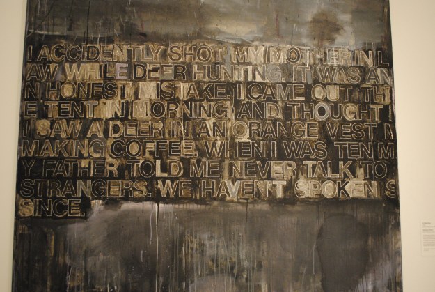
Some highlights include one of my favorites by Cecilia Beaux. Look at that hand, so unfussy, so gestural, so perfect. And the controversial Richard Prince with his snarky sense of humor. I am intrigued by Mark Bradford’s “Amendment #8” because of my own use of text in layers of paint. The artist renders the words illegible and the only way we recognize the meaning is through the title of the work. The loss of meaning in language is something I have had on my mind lately, in listening to language used by politicians.

“John” by Vincent Valdez

“American Servicemen and Women Who Have Died in Iraq and Afghanistan (But Not Including the Wounded, Nor the Iraqis nor the Afghanis)” by Emily Prince
Later, I return to see The Face of Battle: Americans at War, 9/11 to Now. One should not be rushed through this exhibit. The photographs are intimate and breathtaking. The tiny hand drawn portraits of fallen soldiers are too numerous to take in carefully, and it feels shameful not to look at each and every face, despite or because of the extreme volume of portraits. Vincent Valdez creates a haunting homage to his friend, who survived war but not his return home, in a multimedia display including photographs, film and painting.
NOTE: in reviewing this blog post, something is nagging at me about my woefully inadequate description of The Face of Battle exhibit. It deserves more than I provide in this brief summary of art museums visits. To read an insightful article about the artists and people they portray, please click HERE.
Next is a trip to the Hirshhorn Museum of Contemporary Art. The elevated annular building is a sight to behold. After circling around and underneath, admiring the surrounding sculpture gardens and the refreshing fountain in the center, I make my way inside to see the Ai Weiwei exhibit. Initially, I think I can waltz through, briskly taking in the large scale lego mats that present images of faces from around the world. But something makes me stop and read about each and every person. They are each  considered political dissidents and live in places without freedom of speech. Many have disappeared, many are in jail indefinitely, many are dead or presumed dead, and few are free. In addition to wanting to learn about each person’s life and heroic actions, one might wonder, why legos? A conflict, or almost embarrassing tension, exists when learning about tragedy by viewing portraits made from a commonly known toy. It seems playful but is not. I try to imagine the installation as a large mat of photos instead of legos and how another medium would impact viewer perception. It is as if the legos keep the images from being “just another” news story and prompt viewers to think about the personal lives of the portrayed people. It is surprising how the common world wide use of legos somehow makes us feel more connected to each individual than, perhaps, photography would.

To watch a short video of the artist speaking about the ideas presented in the installation, the methods, and the materials used, please click HERE.

 Moving right along, after a good night’s sleep, is the recently renovated National Gallery of Art East Building which holds a world renowned 500 piece collection of modern and contemporary art. For first time visitors, a tip: Be sure to pick up a map and guide at the Ground Level Information desk. The design of the building can lead to disorientation and it is easy to accidentally miss certain areas such as the multiple towers. It is also easy to feel so enamored with the building, you might forget which levels, towers and corridors you have already visited, and which you have missed.
I am startled by the number of pieces in the collection that were part of my art history studies at UA Little Rock. Below is a slideshow of pieces that we discussed during my graduate program and that continue to influence my ideas about art. It is a joy to see the work in person, especially in order to closely inspect the brushwork and color used by George Condo, Wayne Thiebaud, and Cecily Brown. Seeing, up close, the line work and materials used by William Kentridge and by Sigmar Polke is so much clearer than the prints I’ve studied.
Finally, perhaps my favorite of all: the National Museum of Women in the Arts. This is my first visit and I wonder why I haven’t prioritized it before. The collection is much larger than I realized and, again, there is no rushing through….particularly in viewing the special exhibit, “Revival.”

My former professor and friend recently expressed ambivalent feelings about the NMWA. When I asked her to explain, she said she does not want to be known as a “female artist” and would prefer to be known as an “artist.” Her questioning the benefit of this museum made me consider whether celebrating women in a separate space does perpetuate the label, “female artist.” However, like many groups of people who band together in order to create a more powerful voice, one that often goes ignored individually, I believe the NMWA exists because it is needed. As stated in the museum’s brochure and along the entry foyer wall: “Gender bias is less overt today, but contemporary women artists still face obstacles and disparities. Art by women is persistently underrepresented in museum collections and exhibitions worldwide.” I recall work at the Tate Modern that addresses this exact issue and am grateful to the museum for providing additional recognition for women in the arts.

Another unexpected thought occurs to me while visiting the museum…collectively, how is art made by women different than art made by men? Or is it? I am intrigued by this observation and notice repeated themes, some overt, some quite subtle. Much of the art is directly about being female. Many pieces are about the female body and multiple catagories within the subject of the body (how we are perceived, how we are objectified, how we cover ourselves, how we judge each other by appearance, how we are strong, how we compare to elements in nature, how we decorate ourselves. etc.).
I’ll sign off with a few favorites below. Often, I gravitate toward paintings and drawings but this time it is the sculpture that stops me in my tracks and makes me stay awhile. As always, thank you for reading!
Laura
-

- “Topiary” by Louise Bourgeois
-

- “Don’t Touch My Waist” by Cathy De Monchaux
-

- “Cotton to Hair” by Sonya Clark
-

- “Clutching Hands” by Louise Bourgeois
-

- “Tippy Toes” by Alison Saar
-

- “Shan Mountain” by Hung Liu