Tag Archives: figure painting

Contemporary Figure Painting Part 2: A Painter’s Perspective

img_9519

Workshop “Alla Prima” Demo by Felicia Forte

As an artist, learning new techniques and breaking bad habits is a neccessary part of the journey. When one struggles for months or even years to acheive a technical goal, the frustration can settle in like an univited guest who refuses to take leave at a reasonable hour.  When I read that one of my favorite artists, Felicia Forte, was scheduled to teach a workshop at Warehoue 521 in Nashville, TN, I knew that a six hour drive was a minor hurdle and that I must attend despite a busy schedule at home.

During her demos, I began to understand what Forte deems as important, on a technical level, for a successful alla prima figure painting. Pay close attention to drawing the initial large shapes (“one look, one line”), to value, and to color. Think about how to paint each shape with the fewest brushstrokes as possible. As a teacher, Forte uses language with the same rich, saturated economy of her brushstrokes. “When you see someone down the street, you recognize them because of the largest shapes on the face and body, not because you can see the details. Always paint the largest shapes first.”

Best of all, on the first day of the workshop, she demonstrated four specific steps that helped her improve her own paintings. She was quite direct with every purposeful word she spoke and even told us HOW to be students. “Write this down. I want you to take notes. Later you will use the notes when you are painting.” “Take pictures so you can see the steps. I will ask you to use the snaps when you are painting so you can remember the steps while you learn something new.” “Next I will get more quiet. I will be painting. Just watch.” Her blunt language enabled her to do the best job she could while teaching and allowed us to do the best job we could while learning. I was tremendously grateful and impressed early in the first day of the three day workshop.

img_9504 img_9526 img_9533

As a bonus, Forte allowed me to ask her the same questions about contemporary figure painting I asked gallery owners in the previous post. Talking with several gallery owners last week about contemporary figure painting was exciting and insightful. Now I’d hear the  perspective of a rising star. While Forte’s current body of paintings is not strictly figurative, I wanted to pay attention to the similarities and differences between an artist perspective and that of a gallery.

Do you feel like there is a strong collector’s market for figure painting today? Is there anything specifically challenging about selling figurative work?

“It’s funny because…I have no idea. I mean, I’ve spent most of my time getting good at painting and teaching painting. The show I have now at Adend Gallery is the first big show I’ve done, as far as number of paintings. It is 25 paintings, many of which are not figurative. The gallery does say that since 2008 sales have been twice as difficult as before.”

In your opinion, what is the difference between a figure painting and a portrait?

“Well, I don’t think there is enough information in the question. A portrait can be a figurative painting and a figurative painting can be a portrait. It depends on the artist.”

What about when an art collector is admiring a painting and says something along the lines of not wanting a figure painting in their home unless they know the person in the painting? I hear this type of comment about my own work which makes me curious about the perceived difference between a portrait and a figurative painting. 

“Either the artist is not educated or the collectors are not educated. Your question tells me that people need to be more educated about what’s happening in the art world today.”

Will you name a few contemporary figure painters you admire and tell us what you appreciate about their work?

“I like Emile Joseph Robinson who I wouldn’t call strictly a figurative painter. I’ve watched his progress during the last three or four years. He started with pastels, then went abstract and now he is coming back around and is more representational. He is curious, his work is unique and he is inspiring.”

“Daniel Sprick – he is just a master.  I know that his work is unique and impressive and moving. But not moving in the same way as the first guy I mentioned. Robinson paints more like I like to paint myself. I do not paint like Daniel Sprick, but I admire him.”

Do you have any advice for emerging figure painters?

“Beyond the technical? Make sure you are painting for you first and foremost and not your idea of what the market wants. It will become not fun to do. I’d say, enter contests. It is a good way to thicken your skin, a good thing to do, there is a range of prestige in the available contests. In entering them, look at who the jurors are and see if it is worth your time or entry fee.”

“I’ve been conservative about putting stuff in galleries. I spend my time traveling to teach workshops and am not teaching regularly at home anymore. This gives me more time to paint, thus building the gallery career.”

“It usually takes longer and the path is much windier than you think it will be so be able to adjust.”

♦♦♦♦♦♦♦♦♦♦♦

In summary, taking a workshop from an admired artist is an incredible opportunity to push yourself, learn new skills, and gain valuable insight. Thank you to Felicia Forte fstudioblkandwhite2or honing your teaching skills, in addition to your painting skills, so students can learn more than they may have thought possible in a three day workshop. And thank you to Warehouse 521. In three short years, Jeanie Smith has developed an incredible program that attracts top artists from around the world. I’ll certainly keep my eye in the schedule and hope to return soon.

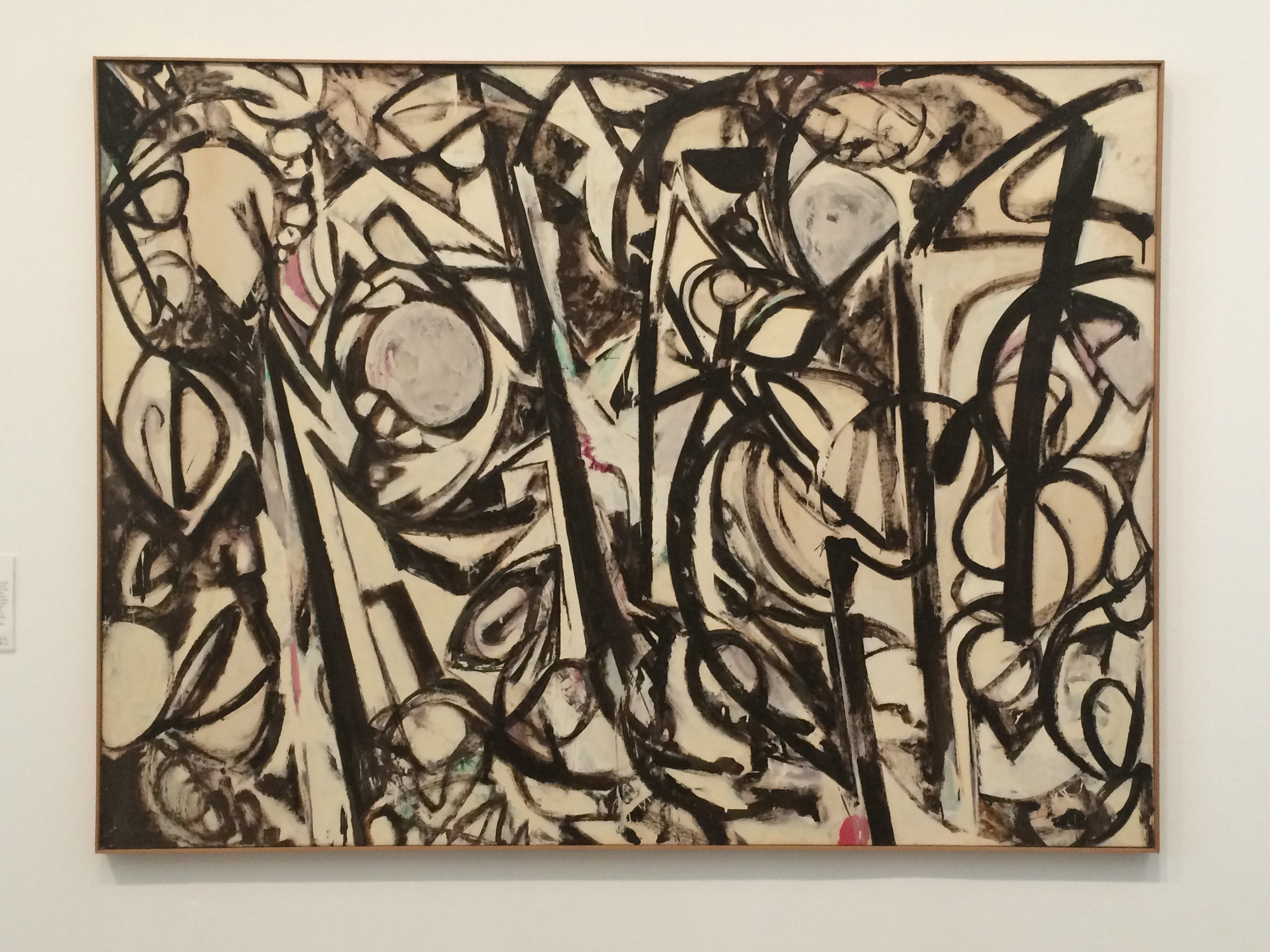
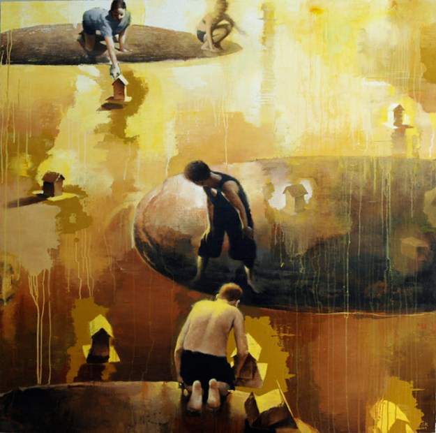
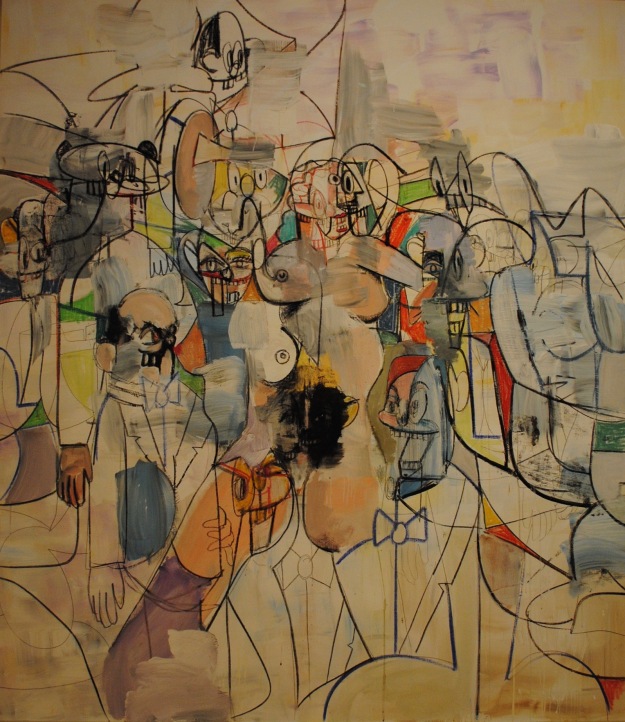
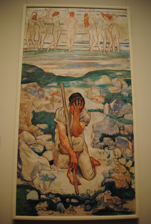
P.S. Below are some paintings from the workshop and from my studio. Ever since returning home, I’ve been practicing what we learned in the workshop. Bad habits are hard to break but I think I’m making some progress. dsc_0655 dsc_0669 dsc_0666 dsc_0664dsc_0658 dsc_0660

Contemporary Figurative Painting Part 1: The Gallerist’s Perspective

DSC_0041

Study of Baby Boy by Laura Raborn

In an attempt to learn more about figurative painting, I concocted an idea. Why not call some of my favorite galleries and ask the owners the questions I ponder? We can learn so much through online research, by visiting galleries, or by finding incredible artists on Instagram. But how about some old fashioned one-on-one conversations? I am extremely grateful to the following galleries for accepting my calls and for taking the time to talk. Of course there are many more galleries I could call but after four conversations, I see patterns of information emerging and feel I’ve learned what I set out to learn. Plus, I don’t want this post to be too terribly long. Here are the notes from the insightful talks.

Rachel Stephens, Wally Workman Gallery, Austin, TX31ib37xge0in
What are the challenges in selling figurative work? Is there a strong collector’s market for figurative work?
“I do think there is a strong collector’s market for figurative work. There are some barriers with figurative work like cultural stereotypes. People have an expectation of what men and women should look like…some people bring to the painting an idealized version in their minds of what they want to see in a figure. So that is one barrier…accepting a figure that is not idealized. There is also sometimes a barrier with new collectors when they don’t know the person in the painting. They sometimes wonder why they would hang a painting of someone they don’t know in their house…but they are thinking more of portraiture. So we talk with customers about the difference between a figure painting and a portrait.”

What is the difference between a figure painting and a portrait?
“To me a portrait is about who the person is…for example in a traditional portrait, there might be objects that connect with the person, that are meaningful and define the person. But a figure painting is not neccessarily about the person and who it is, it is about an idea and what an artist is trying to say.  I hope that people look at figurative work and see something that reminds them of something in their life. The painting is also about what the viewer brings to it.”

Who are some of your favorite figure painters working today?
“Oh, there are so many. I enjoy Malcolm Bucknall. His work has anthropamorphic qualities that he uses to bring a narrative to each painting. Elizabeth Chapin’s use of color and line – it is really about how she paints more than what she is painting. I love Patrick Puckett. His figures are definitely not about specific people. I’ve always enjoyed Lu Cong’s work and the work of Kris Lewis – both have haunting qualities. Of course, Kehinde Wiley. We see his work influencing so many emerging figurative artists.”

“Ellen Heck is a printmaker whose figurative work is mostly children – she captures adolescence in a such a beautiful way. We have a show coming up in November for artists Sara and Shane Scribner. The couple shares a studio and models and it is always to interesting to see the similarities and the differences in their work that comes from working in a shared space.”

“Figurative work is what I collect myself. I explain to people who come in the gallery that figurative work is like a great book. You can keep returning to it and keep reading new chapters. You can keep going back to it and continue to “read” a painting.”

Greg Thompson, Greg Thomspon Fine Art, Little Rock, ARgreg-thompson-fine-art-interior-shot-gallery-8-6-14-lr
What are the challenges in selling figurative work? Is there a strong collector’s market for figurative work?
“We don’t sell many traditional figurative paintings.  But as for any type of figure in the composition, well, it depends on the artist. Carrol Cloar, for example, I consider to be a figurative artist. The figure is in a scene. We sell lots of Kendall Stallings work and over half of his work is figurative. He uses the same type of figure again and again…the man in the suit in different scenes. These works have something mysterious about them, something to make the viewer try to figure out what is happening.”

“I sell secondary market work that is figurative such as Picasso. We have a very nice painting now by William Schwartz and it is figurative. And I recently sold a Thomas Hart Benton which is figurative. His work always connects the figure with the scene and there is a narrative.”

“When I think about places like the Arkansas Arts Center, and they have a large number of figurative pieces, I think about the history there. Starting with Townsend Wolfe, they’ve bought work from galleries all over the place and in the work they collect there is always more going on in the composition than just the figure. There is mystery or a narrative. Like their William Beckman pieces. They have pieces that are self portraits but there is something mysterious about the way the artist presents his own figure, like a missing arm or something strange is happening to make the viewer wonder. There is layer upon layer of something else going on….I think this is what makes interesting art. There are many artists like this, Odd Nerdum, for example.”

Do you have a favorite figurative artist?
“Thomas Hart Benton is one of my favorites – it is his form and his approach to the human figure, the way he ties the figure to the surrounding landscape or scene. He creates a narrative and says so much with the way he paints the figures.”

Dolores Justus, Justus Fine Art, Hot Springs, ARy1vlmuw9_400x400-2
What are the challenges in selling figurative work? Is there a strong collector’s market for figurative work? 
“It is actually hard to say. I have had people in the gallery who would only consider figurative work in which the subjects are depicted as more universal forms and not particular people. There are others who want the specific characteristics of the individual. The real test lies within whether the work is good. Good, truly original work speaks to the viewer.”

33a65ef7-a623-4bb1-bfd6-b32882e46de1-2

“Katie and Her Fish” by Emily Wood

“Emily Wood is a wonderful figurative artist who depicts people doing everyday things with a great deal of detail, however because the subject is engaged in activities that are well known to the viewer, they can easily relate to the works. The artist often refers to her work as being “universally specific” and judging by the response to the paintings, I would say they hit the mark. It should also be noted that the pieces also happen to be very well executed.”

“I know that I personally tend to shy away from overly idealized figurative work, along with pieces that are demeaning or exploitively disturbing.”

“People are always going to be drawn to the figure. Even in non-representational work, many people see faces and figures that were not intended by the artist. The key to whether it is collected again lies with the quality of the individual work.”

What is the difference between a figure painting and a portrait?
“To speak in generalities, portraiture tends to follow a seemingly standard arrangement. The figure is in a still position, facing forward and the artist is seeking to capture the likeness and personality of that particular person in that setting. A figure painting is the larger circle into which any painting that incorporates a figurative form is included.”

Who are some of your favorite figure painters working today?
“Close to home, I am happy to be able to carry work by Emily Wood, Rebecca Thompson, and Laura Raborn. Three women artists with very different approaches to the figure, but all with their own unique interpretation. Further afield, I greatly admire the work of Daniel Sprick, Ali Cavanaugh, and David Shevlino, among others.”

Robert Lange, Robert Lange Studios, Charleston, SC1341332108-img_4836thumb
What are the challenges in selling figurative work? Is there a strong collector’s market for figurative work?
“We are fortunate in this town – figurative work does rather well. Selling figurative work is not problematic, especially when you find truly unique work. Say you put 100 paintings in front of you, when you can identify each artist, you know the work is not like everyone else’s, its totally creative and unique and about that one artist. Then selling it tends to not be a problem. That’s what we collect personally. I wish portraiture was more accepted. People question why they would hang someone so specific on their walls, but it’s my favorite.”

What is the difference between a figure painting and a portrait?
“I don’t know if there really has to be a difference between portraiture and figure painting. Sometimes it can be about the directness of the eye contact. So if the figure is looking away, the painting can become about something else. A narrative can begin to form. We are gifted in the the collectors who come to the gallery tend to be comfortable with the figure. So they are not as hesitant about figurative work or something that looks more like a portrait.”

Who are some of your favorite figure painters working today?
“I would say Jeremy Geddes. You must take a look at “A Perfect Vacuum.” He has almost an Andrew Wyeth handle on the paint and light. The work is humble, the palette tends to be quiet but the figure is so powerful, so dynamic. I would also say Brad Kunkle. His figures are profound. And David Kassan. His paintings look like they take years to complete….hundreds of layers building up the surface. The surface of a painting is what fascinates me these days. And Candace Bohannon. She is an incredible painter. There is an intimacy, a quietness, a profoundly introverted nature to the models. Her application of the paint is so slow and thoughtful. The paintings by Karen Ann Myers are beautiful, detailed, psychological portraits. She’s got something special.”

♦♦♦♦♦♦♦♦♦♦

After talking with the gallery owners, some specific comments and ideas stand out.

Each gallery owner uses the word “unique” when describing the style of their favorite artists. Greg Thompson and Rachel Stephens talk about a narrative or something mysterious happening in today’s figurative compositions. The gallery owners seem to agree on the general idea that overly idealized figurative work is not sought after or as provocative. As Dolores Justus states, “I tend to shy away from overly idealized work….” Additionally, there is an emphasis on the artist finding his or her individual path and creating work that reflects something personal.

Robert Lange’s utter enthusiasm about figurative work and about specific artists is infectious. Early in our conversation he explains, “Megan and I decided when we opened the gallery we would run it like artists and not like art dealers. We wanted the artists to be free to take risks and try different things, even if the result was failure with a certain body of work. Those risks can lead to an artist’s best work.”

Why? What? 12x12" watercolor on clayboard by Ali Cavanaugh

“Why? What?” 12×12″ watercolor on clayboard by Ali Cavanaugh

When I mention gallery owner, Dolores Justus, just told me that Ali Cavanaugh is one of her favorite figurative painters today, Lange excitedly explains, “There are so many artists who find their way and find success and then plateau. I commend Ali for considering a new chapter even when her style was working well and she was having great success with her body of work. She wanted to try something new which took courage and I really admire her for that. Her new paintings show one of Ali’s greatest skills – she knows when to stop. She has an amazing sensitivity of knowing when to stop.”

Lange spoke of specific paintings and artists with unadulterated joy and admiration. While he spoke of being fortunate for the figurative collectors in the Charleston area, it occurred to me that he and his wife, Megan, surely have helped figurative work flourish in the area. He has a way of educating that opens eyes and minds to the beauty and messages in art. “As artists, our art is a visual journal. I love it when artists share why they do what they do, when it becomes personal and real.” I imagine he is skilled at sharing this concept with clients which is a win-win-win situation for the gallery, for the artists, and for the collectors.


Returning to Winter Park, Florida Among Memories and Art: Part 2

During my Rollins College days, I had an internship at the Orlando Museum of Art. Reading IMG_9022about the museum recently, and the current “Florida Prize” exhibit, made me excited to return. As an intern, I rode my bike from Winter Park down to the museum but this time, I took the brand new SunRail line which picks up at the conveniently located train station in the park along Park Avenue. The line is scheduled for expansion and I hope the train catches on amongst visitors and residents. It was cool, comfortable, quick and easy. And cheap. To visit the Museum area of town, I exited the train at the Florida Hospital station and walked 10 minutes to the museum. The area has changed drastically since my college days – the hospital complex is modern and massive. Loch Haven Park is home to not only the Orlando Museum of Art, but also the Orlando Fire Museum, the Orlando Repertory Theatre, The Orlando Science Center, the Orlando Shakespeare Theatre, and the Mennello Museum of American Art. Looks like I’ll have to return!

IMG_8991 IMG_8987As I entered the refreshing  lobby after a hot walk, I tried to get my bearings. But nothing was familiar…I did not recognize the floor plan whatsoever. And oh my, how the collection has grown. Was this exquisite Robert Henri here back when I worked for the marketing director? What about this John Singer Sargent? Was I oblivious? Or did I admire these exact paintings and have forgotten? How many other activities might I be repeating, unaware that the delight of discovery is actually rediscovery? At any rate, the collection on display is impressive. It was my lucky day: in addition to the popular Florida Prize, there happened to be an exhibit titled, “Contemporary Figurative Art: Selections from the Orlando Museum of Art Collection.”  As a figure painter, I grasp with enthusiasm this part of the show’s description: “By provoking the viewer to question what they see, and discover interpretations of their own, artists have continued to make figurative art meaningful and relevant today.”

IMG_8996There is an Edward Ruscha that reminded me of the stencils I’ve been using in my work. Of course, he has the courage and skill to not overcomplicate, something I’m struggling to learn. The artist worked on the painting for two years before adding the two inch yellow ruler and states that the simple nonsensical item is open for, and expands, viewer interpretation. Another piece that lures in viewers is the Chuck Close portrait of his wife, Leslie. We don’t have to stand too close to IMG_9001realize that the entire value system is made of thumbprints. The sight of the thumbprints evokes an intimacy, the thought of touching, and the idea of the artist’s hand at work.

After visiting the collection, I moved on to see the work by 10 contemporary artists who were accepted into this year’s Florida Prize. Like the current exhibit, “Displacement” at the nearby Cornell Museum of Art (see previous post), a recurring theme among the work is geography and human movement around the globe. Despite the appeal of a material variety and the artistic use of technology, the artists whose messages I found to be most accessible, were Michael Vasquez and María Martínez-Cañas. The large scale paintings by Vasquez dominate the room due to size, bright color, high value contrast, and the intimidating characters themselves. Though we know the figures are tough, there is something humanizing about creating large portraits of all types of people. We are reminded that they are just that: people. Perhaps the artist wants to emphasize their dangerous persona. But I see boys who are in men’s bodies and who want to be recognized, who want to be powerful, who want to be important.IMG_8985

Martînez-Cañas uses multiple layers of paint and photography to create comIMG_9011positions where information is altered, obscured and redefined. In Washington, D.C., I had the pleasure of seeing her work, though very different from these pieces, at the National Portrait Gallery. I wrote then about the artist’s unique ability to use alternative methods of photography to engage viewers. There is much to discover in her pieces in the Florida Prize exhibit and the complex arrangements of imagery is both perplexing and revelatory, reminiscent of the mysteriously alluring Robert Rauschenberg style.IMG_9015

Although the Orlando Museum of Art did not match my memory of the place, it was such a pleasure to return to the location of my very first art-related job. If you are in the Central Florida area, the museum is a must-see. And don’t forget to allow time to explore the area. The multiple museums and park are definitely on my list for next time.

As always, thank you for reading. Up next: Part 3 in this series on Winter Park. This time, I’ll cover the Crealde School of Art and the Polasek Sculpture Garden.IMG_9032

Opening Minds through Travel: Noticing the Art of a Place – Part 2

Continuation of previous post:

After two days in magnificent north Wales, we headed to Oxford for one day before visiting friends in London. In London, art rose to the top of the priority list, as the city is overflowing with superb, and free to the public, museums.

IMG_8689I hardly know where to begin with impressions of the newly reopened Tate Modern. I was initially confused and off balance (literally, the floors in one of the buildings are awkwardly sloped causing a strange senstation of movement or falling). But once I figured out the floor plan and made it to the galleries, I couldn’t supress my astonishment. The Guerilla Girls, thank goodness, are promintently dispalyed and lord knows they need to be heard. IMG_8685IMG_8684

"Carnival" by Max Beckmann

“Carnival” by Max Beckmann

There hangs “Carnival” one of my all time favorite Max Beckmann paintings. An extensive, insightful and wonderously dark Louise Bourgeios exhibit was quite a draw for the crowds. It made me so proud that Crystal Bridges Museum in Bentonville, Arkansas, dispays one of her mammoth spiders. There is relatively lots of work on display by women artists such as the energetic painting by Lee Krasner (see below). There are several huge paintings by Luc Tuymans (who until now I’ve only seen in books). And check out this Peter Doig painting that makes me finally understand what the big fuss is about.

IMG_8697

“Ski Jacket” by Peter Doig

IMG_8706

“Gothic Landscape” by Lee Krasner

The Tate Modern is full of provocative, stunning art. It might be best to visit in the morning, go next door to The Globe for a Shakespeare play, eat a meal, and return to The Tate for a couple more hours of wandering. At least, that’s my plan for next time.

I often refer to viewing certain art works as akin to meeting a beloved, handsome super star. It leaves me giddy and breathless. Visiting The National Portrait Gallery during the recently hung BP Portrait Award was no exception. My daughters sat on a bench in the center of the largest gallery and watched (ok, I think they made fun of me) as I jumped from one painting to the next. This is the work I most admire. These are the artists I idolize. This annual exhibit showcases the content, the concepts, the materials and the techniques I strive to apply and master in my studio. Someday, oh someday, it would be a dream come true to have a piece accepted in the venerable competition; not for the accolades, but for the sheer satisfaction of developing a painting ability of such high quality. The exhibit contains numerous familial realtionships: several artists painted their sons. For the most part, the artists painted people they know well and it could be said that a theme of deep, intimate relationships domintes the exhibit. It was hard to choose which paintings to post – here are four of my favorite:

IMG_8732

“Jean” by Jean-Paul Tibbles

IMG_8720

“Self Portrait in Pembroke Studios” by Eileen Hogan


IMG_8726

“Tad” by John Borowicz


"Dad Sculpting Me" by Jamie Coreth

“Dad Sculpting Me” by Jamie Coreth


Just look at Tibbles ability to capture his son between boyhood and manhood. The soft edges and slight movement in the background over the young man’s left ear indicate to me the boy’s continued growth. He is not quite finished developing and figuring out who he is in his world. And look at Hogan’s self portrait in her studio. She so beautifully blends the figure with the space. We know that she is part of the space and the space is part of her being. Borowicz painted his son, Tad, whose bare chest, forward little shoulders, and out-turned ears draw viewers close. The innnocence, posture and skin evoke parental awe whether or not the viewer is a parent. One of my very favorites is by Jamie Coreth, whose subject is his father sculpting a bust of Jamie. This circular arrangment allows veiwers to delight in the relationship between a father and son, between a sculptor and painter, between art mimicking life and life mimicking art. The pointing devices throughout the composition, the direction of the eyes, the father’s hands upon the head of his son….all details that make this painting one to enjoy for hours, or a lifetime.

During our final two days in London, we were quite exhausted and visited two museums that require more engery than we could muster. That DSC_0924being said, I was utterly blown away by the thrill of seeing the Rosetta Stone at The British Museum. Written language is something I explore in my own DSC_0923work; therefore, I find any reference to the early written word to be exciting. The museum’s Mesopotamia displays, which include examples of early language, are hard to swallow in one visit. If given the opportunity to return to London, I will certainly visit The British Museum again (first thing in the morning, after a good night’s sleep!).

I would also like to return to The Victoria & Albert Museum. It was worth the effort to pop in after a morning at The Natural History Museum, although seeing the exhibit signs made me realize what we were missing. The architecture and back courtyard are worth a visit for those short on time, and the younger kids loved the wading pool which was a nice break in the afternoon.

IMG_8792

Clearly, another trip to London is in order. There were many places, such as the Hunterian Museum, that we did not get to visit, and many places that require more time and attention. We did the best we could though before hopping on a northbound train…next up York and Manchester. Thanks for reading! LauraIMG_8692

Spring Break in NYC: Art Nirvana

In a time when art is more loosely defined than ever, where there are no limits to what materials artists use, where anything imaginable can qualify as art, and where idea sometimes trumps craftsmanship, I return home from a trip to New York City electrified and inspired. Only in David Zwirner did I wonder, “What the?” Having said that, I know my personal lack of understanding an art installation does not reflect poorly on the art; perhaps it is my limited exposure to certain materials or styles that leaves me perplexed. My own education or perspective could be the problem.

While visiting roughly twelve galleries and four museums during my daughters’ spring break, I was repeatedly delighted by the quality, talent, and thoughtful presentation. For this trip, I focused on painting exhibits and found that representational painting, much of which was figurative, dominated the walls. One reason I paint representationally is because I believe art is most powerful when the highest number of people can glean some understanding, some insight, some information about a subject presented. Art made for an exclusive few seems to deny itself the chance to speak clearly about culture, about society, about life and about issues in a way that can eventually serve as documentation of our time. But maybe art does not have to represent anything specific. Maybe odd installations tell of a need for something real, three dimensional, touchable, formidable in a world inundated with visual imagery. Yet I can hardly resist the allure of a two dimensional painting or drawing that serves as a magical window to an idea. Yes, two dimensional work is an imitation of something, it is a copy. But the flat plane can reach our minds, our emotions, our thoughts. A great painting or drawing feeds, informs, opens, provokes, teaches, records and delights us.

Following are a few highlights from our visit:

IMG_0565

Alyssa Monks, Become, 2015, oil on linen, 50 x 80 inches

Alyssa Monks at Forum Gallery. I expected to feel disappointment over her departure from water paintings. However, the current body of work, “Resolution,” is stunning and exquisitely painted. The artist merges the human form with forest and plant environments. While the figures embody large swaths of canvas, they do not dominate the space. Instead, towering trees and foliage promote the idea of humans as secondary to earthly growth. The paintings allow us to see the intertwined existence of all living things. Combining human features with elements from nature is difficult and looking closely at the paintings shows how the artist chose certain brush marks and colors. The Forum Gallery website allows viewers to zoom in on the brushstrokes which is helpful and revealing.


IMG_0562

Claudio Bravo, Morocco Triptych, 2009, oil on canvas

Claudio Bravo at Marlborough Gallery. For years I have tried to figure out what exactly draws me to the entrancing work of Bravo. He is able to arrange material in a way that encourages the viewer to imagine how the material folds and feels. He is a master of value, creating shadows, highlights and folds that become almost linguistic. The contrasting colors he often uses prompt the viewer to repeatedly return to the work. Though it is often the human figure that draws me to a painting, Claudio Bravo’s still lifes reveal a vision and skill that is always worth studying in person when given the opportunity.

big-black-hat-after-gainsborough-60-by-48

Rimi Yang, Big Black Hat After Gainsborough, oil on canvas, 60 x 48 inches

Rimi Yang at Stricoff Fine Art. I first fell in love with her fantastic layered work while studying my aunt’s fine art collection several  years ago. Since then, I have found Yang exhibited on the east coast, the west coast and in between in Austin, TX. Rounding the corner of 11th and 25th in Chelsea, my eye landed on this painting (here on the left) and I immediately knew I’d once again found one of my favorite artist’s work. As I struggle, sometimes failing and sometimes succeeding, to paint the figure in an abstracted space, I think often of Yang’s  ability to create mysterious settings that allude to history, time, and things being covered, or painted over or washed away. I LOVE her precision used only sparingly and how it contrasts with loose brush marks and drips. I LOVE the exquisite details that contrast undefined areas. She makes it look so easy and it certainly is not. I was grateful this painting caught my attention because it turns out Stricoff Fine Art also carries many artists I admire such as Carol O’Malia and Joshua Bronaugh. We hit the jackpot! As a bonus, I got to meet gallery director, Michel Vandenplas, who was very kind even though my girls were basically sprawled out napping on a couch toward the back and I’d taken a photo of a Yang painting which I learned was not permitted. Despite all this, he was completely welcoming and gracious. Sometimes, when the details of a busy trip fade into the past, it is the kindness of strangers that stays with us. Speaking of a welcoming and kind stranger, next up…

Garvey Simon Art Access. When submitting work for the Delta Exhibit at the Arkansas Arts Center, I read about this year’s juror, Elizabeth Garvey and was excited about the possibility of meeting her and seeing her gallery. Though we had no appointment and just stopped by to say hello, we were warmly welcomed. Liz graciously guided us into her office to show the work of many of the artists she represents. What first struck me in glancing at the walls was the pattern created by the wide variety of artists and their meticulous high quality use of materials.

c1c121be4be8f12c4203a8edf3d380cc

David Morrison, Stick Series No. 12, 2015, Colored pencil on paper, 14 5/8 x 21 3/4 inches

Much of the work on display was abstract forms from nature. Much of the work took something recognizable from the world and zoomed in for a hyper close view which helps viewers let go of the meaning of the things presented and see things in a new light. Ever since hearing Hank Willis Thomas speak about his work,  I deeply appreciate art that helps a viewer let go of a preconceived notion and see something in a new way. I was particularly drawn to the work by Julia Randall who shows us a view of life, of the human mark, of the fragile moment, in ways we surely have not considered. Her close look at various subjects – dead flowers, billowing empty plastic bags, chewed bubble gum – each involve air in one way or another. Not air that gives life, but air that is used and old. Whether the human form appears or not, the idea of a person involved with the item is ever present.


MF-124-time

Time, 2006 Oil on Panel, 36″ x 36″

Gallery Henoch. Finally, I was delighted to find Gallery Henoch, which has been in business for 50 years representing realist artists such as David Kassan, Burt Silverman, Daniel Greene, and Max Ferguson. For four years, I’ve regularly visited Crystal Bridges Museum of American Art and never tire of the painting, “Time” by Max Ferguson. Though I did not get to see Ferguson’s work during our visit, the majority of the work on display was by Gary Ruddell. He creates a space for the figures that presents the idea of fantasy, or memory, or the world of youthful imagination. The looming deep shadows contribute to a slightly eerie or dangerous atmosphere though the figures seem content in frozen playful gestures. With backs turned away and eyes cast downward, there is something unreachable about the worlds in which the figures exist. I am grateful to have found another artist to admire who can create evocative compositions using semi-realistic spaces for figurative work.

GR-188-Small-Journeys

Gary Ruddell, Small Journeys, Oil on Panel, 54″ x 54″

GR-186-Pinball-Cha-Cha

Gary Ruddell, Pinball Cha Cha, Oil on Panel, 60″ x 60″

There were so many more inspiring exhibits but this post is getting long…below are photos from our wanderings at the MOMA and the Met. Thank you for reading!

Laura

DSC_1025

Robert Motherwell

DSC_0926

Takashi Murakami

DSC_0920

Cy Twombly

DSC_1038

Jim Dine

DSC_1041

George Condo

DSC_1036

Robert Rauschenberg

IMG_0591

Francisco de Goya

DSC_1043

Philip Guston

DSC_0914

Jean-Michel Basquiat

IMG_0580

Jasper Johns

DSC_1033

Joan Mitchell

DSC_1045

Ferdinand Hodler

DSC_1029

Willem de Kooning


Accepted! Touring Arkansas with the “Small Works on Paper” Exhibition

ChairandStripes John Watson

“Chair and Stripes” by John Watson

I often write about museums and gallery exhibitions and about artists I admire. This time, as I introduce a long running Arkansas favorite exhibition, I get to include my own work in the post. Yes, one of my paintings was accepted in the venerable Small Works on Paper show! In it’s 29th year, the Arkansas Arts Council’s traveling exhibit includes 37 works on paper with a maximum size of 18 x 24″.  This year’s juror was Kati Toivanen, Professor of Art and Associate Dean for Undergraduate Programs in the Department of Art and Art History at the University of Missouri, Kansas City. I am grateful to be included in this outstanding show.

“Seeking” by Laura Raborn

The painting Toivanen selected is part of an ongoing body of work where I explore the passage of time and memory. The young girl stands among faded ruins that once housed lives and dreams. The architectural structure is enveloped by a layer of clouds which allude not only to the passage of time and its impact on a vacant structure, but also to our memories of a place. Notice how the semi-transparent cloudy layer begins to interrupt portions of the girl’s body. Notice how the weeds at the base of the building irrationally grow over part of the girl’s body. These details refer to the passage of time and how our own aging constantly alters what and how we remember. She could be looking back on her own childhood, or remembering a special place. Or she could be dreaming of a place or trying to recall a faded memory.

Our own history and experiences alter how we see our surroundings. We inadvertently apply our history to everything we view, letting our perception become our reality. Everything we see, and everything we think we remember is only a biased, warped, individual account, leading me to conclude that there IS no reality. Perhaps the passage of time in our minds versus the passage of time in the physical world in which we live are like two parallel universes. We see glimpses of the other universe – our physical world – but only partial ones. And our minds draw conclusions based on our individual memory and experiences. Now that I’ve utterly confused myself with these thoughts, you might understand why I have a hard time painting these ideas. But I can hardly stop. It is part of my being to ponder these ideas and put them in visual form best I can. Giving me hope, though setting the bar high, is writer and physicist, Alan Lightman. His article “Ghost House of my Childhood” and his best selling novel, “Einstein’s Dreams” are two sources of great inspiration (to read more about Lightman’s influence on my work, see previous post titled, “Struggling to Convey Certain Ideas Through Painting: The Influence of Beautiful Writing”). I hope to someday paint half as well as he writes about time.

Oona_Galusha-Clarkeweb

“Oona” by Clarke Galusha

The annual traveling exhibition must be quite an undertaking for the Arkansas Arts Council: first the call for submissions, hiring an out of state juror who judges hundreds of entries, then the selection and collection process, the purposeful and cohesive framing, the opening events, and the repeated packing and transportation as 37 works travel to 10 venues throughout the state. There is no telling how many tasks and steps I failed to mention. We are lucky to have an organization willing and able to provide artists with an opportunity to display artwork in so many locations during the course of one year. For the exact dates and locations, see schedule below. And if you find yourself nearby, please visit this year’s Small Works on Paper exhibit!

2016 Small Works on Paper Touring Schedule

January 5-29 Batesville Area Arts Council
February 4-26 Hendrix College, Conway
March 4-30 Arkansas Tech University, Russellville
April 1-30 University of Arkansas, Fayetteville
May 6-27 University of Arkansas at Fort Smith
June 4- July 9 Searcy Art Gallery
July 19- August 27 Delta Cultural Center, Helena
September 1-29 Arts Center of the Grand Prairie, Stuttgart
October 6-26 University of Arkansas at Monticello
November 2-28 University of Arkansas at Hope

The Joys of Teaching Mixed Media

DSC_0029This is Part 1 of a series on teaching mixed media

A rewarding result of going back to school was my exposure to many great teachers. Their technical knowledge, teaching styles, communication, critiques, and guidance helped me become a better artist. One consequence I did not foresee, was these teachers would also help me become a teacher. I suppose it is deep gratitude toward these people that makes me want to share what they have shared. As a way of honoring and thanking such talented professionals, I strive to be a great teacher.

Teaching the “Happy Accidents” mixed media class at the Arkansas Arts Center provides me with an opportunity to channel my former teachers. Students see me at the front of the room lecturing through a demo, but they are actually getting a David Bailin inspired drawing lesson. Or as I circle the room with individual instruction, the students are experiencing the questioning technique of DavIMG_6106id Clemons who taught me that listening is essential in critiques and often more important than talking. I’m finding as I teach workshops, most students want to learn new techniques but most of all, they want to be heard and want to use the workshop, and their art making to help them communicate. And people want to experience moments of success and joy that art can bring. As abstract artist Pinkney Herbert (as seen at an Arrowmont workshop on the left) taught me, kindness and caring about students can go a long way in helping them learn.

How does a mixed media class meet these needs? Well, for starters, I ask the IMG_0249students to leave their fear at the door. The class is a place to try new techniques, to experiment, to focus on method and not on results. This is a chance to stop trying so dang hard to achieve and stop comparing ourselves to others. What a relief! The more students are able to take this advice, the more they accidentally create amazing pieces of art.

In this series of posts, I’ll describe the workshop and outline specific techniques in case you want to try them at home, or share them with a friend. Perhaps you can sign up for a workshop at the Arkansas Arts Center. Over the next three weeks, I’ll post five or six entries discussing:

1. stencils and stamps
2. image transfer
3. collage
4. text and language
5. drawing
6. building texture and layering

So, to get started during Day 1, using acrylic paint we quickly add a ground layer to two pieces of paper. The paper must be heavier than drawing paper in order to handle the multiple layers to come. As the paint dries, students answer a few questions that are meant to prompt them throughout the three day workshop, and offer ideas if they feel stuck. I ask questions such as, “What is your favorite place to spend time?” “If you had a completely free week, what would you do with your time?” and “Do you have any favorite words, quotes, poems, lyrics?”

IMG_0267And then the action really starts. We cover various tools and ways to apply paint to paper. A paint brush works fine, of course, but imagine the marks made when dragging the paint with a squeegee? Or using a straw to blow paint around, or dabbing paint on with a sponge, or splattering with a toothbrush?

While that layer dries, we review compositional guidelines and elements of design. Version 2Throughout the workshop, students can look at the terms on the chalkboard and learn to self direct and analyze their work.  We discuss scale, value, contrast, line, the color wheel, texture, and pattern. We discuss how to abstractly represent an idea and how to simplify subject matter. And one of my favorites – we discuss layering, and how the additive and subtractive process of layering builds an alluring surface that is rich with information and history. Though we could spend days on these lessons, the 20 minute discussion helps students learn language and methods that quickly improve the quality of their work. To really drive the key terms home, and get a deeper understanding, we watch a few short videos on artists such as Chris Wool, Joan Mitchell, and Sigmar Polke. The work of these iconic artist leads to many “Ah-ha” moments and the students rush to get back to their work stations.

STENCILS AND STAMPS

DSC_0411In the next layer, we work with stencils and stamps while considering pattern. Artist Traci Bautista has fabulous demonstrations on the website Stampington.com and we all agreed that this is not stenciling as we remember from childhood. While places like Michael’s Arts and Crafts carry beautifully designed stencils, you can make your own for free. Using parchment paper, drawing paper or cardboard, you can cut all kinds of shapes, patterns, and letters for one-of-a-kind stencils. Notice that when cutting your own stencils, you will end up with two pieces: a negative (the hole that remains in the paper where the shape used to be) and a positive (the shape you cut and removed from the paper). Both pieces can be used for stenciling. Additionally, instead of laying the stencil on your surface and painting around it, you can paint directly on the stencil, flip it over and press it into the surface where it acts as a stamp (styrofoam works really well). Once you start stenciling and stamping, and get a handle on all the possibilities, you might notice all sorts of products in your trashcan that add pattern and shapes to your paintings.

photo 1For example, pictured to the left are two store bought stencils and two from my trashcan (one piece of cardboard and one styrofoam tray that I cut a leafy pattern into with an exacto-knife). These four items were used to add the pink and white layers to the green and yellow background seen below.

photo 4 photo 3

Using hand drawn stencils cut from drawing paper (which I stick on the window for possible future use), my goal in the painting below was to create a dream-like Venice inspired arrangement. First, with a large brush, I applied brown loose brushstrokes. Then I applied a muted watery green partially covering some of the brown. Next, came the stencils. Using a thin consistency of off-white paint, I painted around the stencils, repeating the architectural forms and the horse shapes that were each based on images from Piazza San Marco in Venice.

photo 3IMG_0301IMG_0302

IMG_0303

IMG_0304

IMG_0299

So, what’s the point of using stencils? When creating a painting, I think often about CONTRAST. Work that has contrasting colors, subjects, shapes, or brushwork, for example, tends to engage the viewer. Stencils allow an artist to contrast hard edged shapes with loose brushwork, as seen in the above example. They also allow for recognizable imagery to contrast abstracted areas. One artist who provocatively contrasts stamped or stenciled images with loose abstracted areas is Firelei Báez.

IMG_0344

Detail, The Last One Who Remembers It, 2015 by Firelei Báez

photo 2 (1)

Detail, Trust Memory Over History, 2015 by Firelei Báez

Her exhibit, currently showing at the Perez Museum in Miami, explores identity of a group of people. Initially, many of the pieces appear to be organic and bright, with perhaps a focus on animal life and the natural world. However, once the viewer’s eye lands on stamped chains, fists, foot prints, and hair picks, we begin to see much more than nature, pattern, color and abstraction. We see symbols, shapes, stereotypes and history associated with a group of people. Suddenly, our minds are forced to acknowledge a darkness amongst the beauty presented by Báez. Again, CONTRAST is an important element used by the artist. And stencils and stamps are one of the tools she uses to create powerful contrasts.

Next up, a student favorite: Image Transfer. Until then, cut out some stencils and experiment!

Michaël Borremans’ “As Sweet As It Gets” is darkly delicious

A trip to deliver a painting to the Irving Museum of Art quickly took a turn in purpose when I read about an event at the Dallas Museum of Art. An exhibition by Belgian artist, Michaël Borremans, was scheduled to open and I have admired his work for years. In my graduate thesis, I wrote about the influence of one of his paintings, Four Fairies, in my work and yearned to see his work in person as opposed to only viewing paintings online and in bofourfairies_borremans3oks. Learning about the exhibit made me deliriously happy, and then came the icing on the cake…the artist would be present for a “conversation” with the show’s curator and all I needed was a ticket to attend. WAIT A MINUTE. I could sit right in front of an international superstar, one of my all time favorite living artists? For 5 bucks?

Juggling work with motherhood can be challenging…I’m often riddled with guilt when choosing work or an art related activity over spending time with my precious daughters. However, I almost never leave town without them, and I schedule my studio time around their schedules. Surely one quick trip to Dallas was acceptable, right?

Here is the information I found when researching March events at the Dallas Museum of Art: “The DMA hosts the United States premier of the internationally traveling exhibition Michaël Borremans: As Sweet as It Gets, co-organized by the Dallas Museum of Art and the Center for Fine Arts, Brussels (BOZAR). The exhibition brings together the artist’s paintings, drawings, and films from over the last fifteen years in a single survey. Join contemporary Belgian artist Michaël Borremans in conversation with Dr. Jeffrey Grove, curator of the exhibition and the DMA’s former Senior Curator of Special Projects & Research, for insights into Borremans’ life and work.”

After about 30 seconds of consideration, I purchased a ticket and knew I would somehow get there. Those with a ticket for the artist talk could also get a sneak peek of the exhibit two days prior to the official opening. This was truly as sweet as it gets. Making the quick trip even more fun (and economical) was a childhood friend’s offer to let me stay overnight.

At this point in my career, listening to a great artist speak about his work, process, inspiration, and use of materials, is a vital boon to my ideas and work. And if that sounds dramatic, I will use an example provided by the artist himself during the conversation. He spoke of Goya, and of seeing Los Caprichos as a teen. The moment he saw the etchings, something in him shifted and his ideas for his future were altered.393px-No_te_escaparas - Goya - Los Caprichos los_caprichos_de_goya_f_010

Artistic influences profoundly shape an artist’s life and work. I find art’s extreme power to influence is difficult to describe. I, too, am influenced by artists and by Goya in particular. When studying art history in Madrid as a 20-year-old college student, I visited Goya’s work at the Prado. The paintings, both those with disguised darkness and those with overt malevolence, luresaturn_devouring_his_sons-larged me in and pushed me away. I’ve never been able to shake the power those paintings held over their viewers. Since then, I see the work of Goya at every opportunity, which is rare, as I do not travel often beyond the United States. But I did get to see those etchings, Los Caprichos, in Santa Fe, NM last year and the genius of Goya startled, scared and bewildered me again. His ability to capture the human condition – both the comedy and the darkest of human behavior – is unparalleled. Perhaps this partly explains why I am drawn to the work of Borremans. He simply presents complex and dark insights to being human. His paintings are alluring, confounding, disturbing and provoking, in a beautiful and violent presentation.

Before I share more about the artist’Borremans - the whistlers comments, let me take you on an abbreviated tour of the exhibit. Not to boast, but I do believe I was the first visitor allowed in…okay, I was a little too excited, but what the heck, it’s fun being passionate and eager. Anyway, upon entrance, I accidentally rushed through the first room, wanting to be alone for a moment. As a longtime admirer of Edouard Manet, I first noticed a piece titled, The Whistler, 2009, which is reminiscent of ManeManet the Fifert’s The Flute Player, 1866. The body position and brushwork between the pieces are similar but Borreman’s painting is darker, not just in hue, but in mood, in message.

Injury to the body is common in his work. There are burns, lacerations, detached body parts and truncated torsos in impossible positions. Often, when my eye could detect no injury, there were aggrieves marks such a rude stab by the paintbrush to the eye in Colombine, 2008.Borremans - colombine

The figures should look uncomfortable but their downcast faces appear neutral, lacking any expression or response to the awkward position, or injury they display. It is as if the people in Borremans’ paintings become objects, and are dehumanized conveying a dark message about being human. Many of the figures are painted in the same tones as the background space making thBorremans - figurinee bodies appear to be the same importance, or the same substance, as their surroundings. I also immediately noticed several paintings of seemingly simple objects. A branch, a mask, a toy, figurines. Whether these objects stand alone in a painting or are presented with human figures, they dominate the space.

For example, in Man Wearing a Bonnet, 2005, an inversion exists where the man becomes a prop used to display a bonnet. The bonnet is oddly alluring with floppy little ears built in and various paintings of the same subject provide multiple views of the bonnet. Is this what deconstructionists do with writing? Strip away meaning, take apart notions, and flatten ideas and impressions so there is nothing remaining but a deep truth found only in nothingness? And exactly what is the deep truth expressed by Borremans? Even after closely listening to the artist speak about his work, I have no answer to that question. Perhaps not knowing is part of the delicious appeal.Borremans - bonnet

I am attracted to the figurative work of Michaël Borremans for many reasons. His paintings are simple yet become complex upon further thought. They prompt the viewer’s mind to unravel a tangle of ideas, often too dark to consider closely. They are beautifully executed – his drawing skills are superb and his brushwork, paint application and color palette are the strangest mixture of calming and energizing, both luscious and void, both warm and cold. Describing the work of Borremans is a process of using contradictory language, rightly so. In case you are confused, let me provide an example. Many of the figures are in positions indicating they could be dead. However, the artist’s use of rich warm tones in the skin indicates blood flow and vivaciousness. These confounding contradictions let viewers intuit something is not right.

After viewing paintings of various sizes in the first four large display halls, a shift in medium occurs with the display of a film titled, The Storm, 2006. The 35 mm grainy film is projected by a colossal piece of noisy equipment and the image on screen flickers. The Borremans-The-Stormambiguous flicker of light could be indicating a damaged or aged film reel or could indicate an intermittent loss of power in the mysterious scene – a room void of detail, purpose or time. The image of three seated men in the room is almost stagnant but the flickering lights and jumpy screen add a rhythmic quality. Though the men appear to be completely still, viewers perceive very slight movement, perhaps breathing, which makes viewing the one minute loop very different from viewing a still photograph that is flickering on a wall.

After the film, the exhibition is filled with drawings, three-dimensional models, photos, and films on small monitors mounted borremans - houseon the walls amongst drawings. Using pencil, watercolor and gouache on found paper and boards, we find lots of little heads and body parts, experiments with scale, repeated drawings of the same subject with varying views and settings, and the artist’s notes and handwriting. The sketches and notes provide some insight to the development of ideas, certainly more insight borremans - punishedthan is provided by the reticent paintings (let me clarify, it is their silence, and lack of answers that make the paintings outstanding amongst contemporary figurative art).

Often, viewers can recognize objects or bodies that appear in paintings earlier in the exhibit. For example, The Greatness of Our Loss is a sketch of two male bodies, which reappear in the painting titled, Two Bodies, 2005. Or a film, such as Add and Remove, 2007 shows a scene that reappears in nearby drawings. Worth noting is that three drawings, The Walk, Sunset, and Add and Remove were each created in 2002 and the film displaying the same shelves with miniature trees being added and removed was produced in 2007. It is as if the artist is borremans Add and removedigging away at the meaning of a thing, and at possible perception based on material and presentation. He explores body positions and objects with relentless agitation and circles back to previous ideas, forcing himself and viewers to look, and think, and look again, and think more – possibly over a long period of time – about a repeated image.

IMG_4540Having studied and copied (my attempt is on the left) the painting The Goldfinch, 1654, by Carel Fabritius, I was delighted by the simple painting of two bird specimens (titled 10 and 11, 2006) and curious about the artist’s slippery attempt to explain why he now paints from nature, something he previously declined. For the next entry, I will talk about Borreman’s brief Borremans birdsexplanation of how he chooses subject matter and several other insightful topics he discussed during the artist “conversation” with curator, Dr. Jeffrey Grove.

Until then, thank you for visiting!

Revisiting Italy…In My Mind and in My Work

DSC_0748Today’s post is a preview to my upcoming exhibit on display at Boswell Mourot Fine Art February 28 – March 5 and again March 21 – April 2, 2015. Upon completion of grad school, I briefly wondered what would drive me to create a body of work in addition to my commission business. The answer presented itself as I applied for, planned, and attended an artist residency in remote southern Italy. The experience provided enough inspiration to last a lifetime and fuel countless bodies of work.

So I see this show as a scratch in the surface, as a beginning to a lifetime of visually exploring ideas I’ve contemplated for many years, ideas that Italy poignantly highlights in a lavish display of architecture, art, sculpture, monuments, ruins, and relics. IMG_4053 DSC_0880DSC_0907 DSC_0381DSC_0087    DSC_1000


This body of work is an attempt to consider and communicate ideas. Specific themes surfaced repeatedly during my travel research: the passage or suspension of time; the strong influence of history in daily contemporary life; and, visual cues contrasting the ancient with the modern. For example, several paintings examine the presence and participation of inanimate objects (see below left image and consider the statue, the key, the chains underfoot, the cell phone, and the purse), such as religious relics and sculpture, in contemporary life. DSC_0755

In Italy, I began to see the omnipresent visual references to history as beacons of light. Details in stonework, in sculpture, in ancient relics and ruins allow the past to shine on contemporary life by guiding us with ancient clues, philosophy and lessons. This body of work examines visual evidence that seems to contrast modern life but actually surrounds, shapes and embodies today’s inhabitants of Italy. DSC_0742

Viewers of this new body of work can consider ideas about history in our their own lives. The work integrates figurative imagery with layers of text, pattern and drawings in a manner that both hides and reveals information, causing viewers to seek answers and ponder the abstracted space in which the figures exist. My hope is that the work invokes thoughtful contemplation for viewers, as it did for me during the creative process.

And if that all sounds like a bunch of artsy talk, take a look at the above painting and I’ll show you what I mean. I hope you will want to study the figures and ask, “Where are they? Are they together and do they know each other? What is their relationship? Is he in her past, present or future? What is that book in her hand? What is he writing? What does that text say in the background around the woman? Who are the faded figures and are they people in his mind, his memory? Is he writing about them? What are those architectural drawings fading into the background?” There are not always answers to these questions. The point is to consider the work, apply it to your own experiences and ask questions that keep you engaged in something, in anything! There is a Robert Rauschenberg piece at Crystal Bridges Museum and the label states his work is about “the effort of searching for meaning rather than specific meaning itself.” Look at the images in your world and in the art you see, and think. You might reconsider an issue on your mind, or see something in a new light. If my work can provoke this type of exploration, then I’ve had some measure of success.

Thank you for visiting! And please visit Boswell Mourot Fine Art in Little Rock, AR if you’d like to see the paintings in person.


How Looking Closely at Life Provides Artistic Content…and so Much More

When working on my recent body of paintings, a common thread appeared in my thoughts and observations: closely noticing things in our lives makes me feel more grateful. Compositionally, I capture moments that seem mundane or ordinary but once more deeply observed or considered, these moments become complex and provoking and can feel like little gifts.

DSC_0901What I didn’t realize is how watching closely in order to find painting content would morph into something much bigger and, for me, profound. By slowing down and doing a better job of listening, looking, and acknowledging my surroundings, I not only developed imagery for artwork, but a gratefulness practice that impacts my every moment and the way I view my world. Life becomes art and art becomes life, indeed!

At risk of straying off topic, I’d like to write about a recent experience. As I list the following kind moments, they might seem unrelated to my career as an artist and to the process of painting. But here’s the thing about it: as an artist, EVERYTHING RELATES TO PROCESS. These examples are an ongoing part of developing work and ideas. I also see them as a consequence of my gratefulness practice heightened through painting.

For those who like the image of a dark, suffering and brooding artist, get ready for an annoyingly optimistic one instead. Without further adieu, here are some lovely moments I noticed on a 4 day trip to New York City.

A young man (in his 20s) on the subway who was headed to an interview downtown kindly helped me with directions and then asked all about my southern home state (my country bumpkin’ accent was an immediate giveaway).

A man at the Museum of Natural History walked up while I was in the ticket line and gave me his extra ticket.

I tried to help a woman with three suitcases get up the subway stairs but her load was too heavy for me to carry up. This brawny arm reached forward from behind me. A big dude asked if we needed help and proceeded to carry the heaviest suitcase all the way to the top.

Again on the subway, a man gave up his seat for my daughter and me during rush hour. He was then smothered in the crowd during the rest of his ride which included several more stops.

UBER UBER UBER: Friendly drivers, good prices, spotless cars, fast service.

At the Brooklyn restaurant, Talde, every staff member in the place was aware of my daughter’s seafood allergy and made extravagant efforts to provide her with plenty of safe dining options. (note – in addition to extraordinary service, the food was delicious)

We arrived at the Beacon Hotel on Broadway and the desk clerk found a room so we could check in three hours early which significantly improved our day.

Two cleaning crew guys at Grand Central Station showed us the way to the restroom and teased us about looking utterly lost there during rush hour.

A college friend whom I rarely see invited us to her swell apartment for a home cooked meal with her family.

The aforementioned friend offered to connect me with an art dealer who specializes in contemporary figure painting. Really? Yes, so very thoughtful.

The bellman at the Beacon Hotel who stored and later retrieved our luggage was friendly and helpful.

The man who showed us to our bikes at Central Park Bike Rental, pointed to my daughter and said, “Come here, shorty.” She thought it was hilarious. When we returned the bikes later, he gave us perfect directions to our next destination.

When my daughter put a dollar in a saxophonist’s tip jar in Central park, he responded, “Thank you, little lady.” I know, I know, some might say this should be expected. But he did not have to say thank you at all. And he did not have to say it with such meaning and kindness in his voice.

The doorman at a friend’s apartment enthusiastically showed us how he works the manual “lift.”

We took a break in the foyer of the New York Public Library. As we ordered cold drinks, the salesman asked my daughter a few questions and said her answers reminded him of this little girl.

When checking my daughter’s shopping bag, the security guard at The Met talked with her about her soft and fuzzy new slippers and pajamas. She could have just rushed us forward or stared coolly into the bag. I guess this exemplifies most of what is on this list: human interaction and taking the time to care and connect, even in massive crowds, even when busy, even when working hard.

Though I have known her forever, the generosity of an old dear friend and her husband never ceases to amaze and humble me. They welcomed us into their Brooklyn home and into their busy lives and made us feel like nothing was more important than our time together (even though they have plenty of pressing tasks each day).

Every police officer was kind and helpful. In fact, everyone we came in contact with was actually nice…I mean really nice. People gave us directions, held doors open, answered questions, and said things like “Have a wonderful day!” It was like manners and helping each other was en vogue.

Even our experiences at LaGuardia and throughout our flights was better than I could have imagined: there were no long lines, the security check was short and sweet, the American Airline employees were jovial (yes, I just used the word “jovial” when describing something about air travel), the woman at the magazine stand was friendly and smiled. Other travelers looked and acted relaxed and positive. I wonder, have I become so jaded that I am absolutely stunned by the persistent loveliness we experienced at each and every turn?

So the next time you assume something about a person or a place, try to show a little kindness and appreciation. You might just get it back ten-fold. Without considering people and ordinary moments for my paintings, I migIMG_3451ht not have noticed and appreciated all the little, yet valuable, human kindnesses we experienced in New York. Thankfully, kindness, as well as artistic inspiration, can find each of us just about anywhere.